Synthplex 2019 Burbank Trip Report

https://twitter.com/nycmusicservice/status/1115971115237695489

The first Synthplex (@synthplex, @synthplex_burbank) was held in Burbank, California, USA, 28–31 March 2019, organized by Michael Learmouth & Michael Lehmann Boddicker (@MBoddInc). Overall, a good event that will hopefully continue. It was great to reconnect with old friends, meet new folk (sometimes remembering we’d met previously at a past NAMM or some other event), and connect over the love of music with a focus on synthesizers.

[ This trip report got delayed since I was busy finishing up a font engineering collaboration project with composer, orchestrator, & engraver Philip Rothman of NYC Music Services (@nycmusicservice) & Scoring Notes (@scoringnotes) to convert & create some music notation fonts based on Petaluma & Bravura from Dorico (@DoricoOfficial) to work in Sibelius (@AvidSibelius). The project was announced and released, today, 10 April 2019. ]

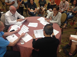
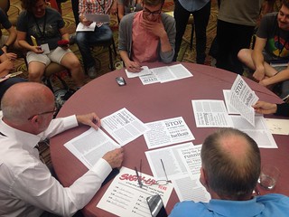
I had to miss Thursday, and finally arrived on Friday afternoon after the drive from the San Francisco bay area. I had hoped to see the Alternate Controllers Panel with Roger Linn (@roger_linn), Judd Miller, and Cory “C Pez” Pesaturo (@CoryPez), but arrived too late. Here are a few photos of that panel.

I stopped by the Sequential (@sequentialLLC) booth to say hi and then headed over for Dave Smith’s talk on Digital Through Analog, Then & Now. He used the fun Prophet X to demo some of the ideas he was talking about. One of his early demos used a Taiko drums patch that can be quite fun to play; then he adjusted filter envelopes, cutoff, etc., to totally change the the sound of the samples being used, just as you would with any oscillator sound source. I used that same base patch for an improv piece, Blind Cacophony, last month with my Prophet XL.

Tom Holkenborg  Junkie XL giving the keynote at Synthplex 2019

Tom Holkenborg (@Junkie_XL) gave the Keynote. It was fun to hear some of his film score stories, including working on Mad Max: Fury Road and Deadpool. He’s also scoring the upcoming Terminator film. At first, George Miller didn’t like the score for Fury Road. Then, later, found he understood what Tom was doing and really liked it. (Aside: I had a similar experience catching up with a former bandmate at a gig last year when he commented that he originally didn’t get what I was doing on the keyboard part for a song we recorded ages ago; then, he had listened to it the other day—it totally clicked and thought it was great.) Tom noted how important an organizing system is for film scoring and that he knows he can quickly locate a piece or cue among 3,000+ over the years. Agreed: organization is key. He also mentioned Score: A Film Music Documentary (@scoremovie) Still need to make time to watch it! Check out his Junkie XL tutorial and studio tour videos.

Tom recently started up SCORE Academy, an intensive program to help grow complete film composers held over a single academic year (September to July) in Tom’s studio. The program is free; students are responsible for their own living expenses in Los Angeles. Looks like a valuable experience for aspiring film composers. I’ve already mentioned it to one future potential student. Tom has one of the largest collection of vintage synthesizers. It was good to chat with him the next morning, too.

Drum  Lace  drumandlace and Ronit Kirchman  ronittweets talking about  Scoring for Film  Media at Synthplex 2019

Caught the end of Drum & Lace (@DrumandLace) and Ronit Kirchman (@ronittweets) talking about Scoring for Film & Media. Good stuff. Alas, I could not be in LA when Drum & Lace played a gig with Suzanne Ciani (@sevwave) at the Los Angeles Public Library this past weekend, 6 April 2019. I will get to catch up with Suzanne at The Mezzanine in SF this Saturday, 13 April 2019. Let me know if you’ll also be attending.

Allee Willis  alleewillis on  Charting Your Own Path in conversation with Michael Lehmann Boddicker at Synthplex 2019

On the way to see Allee Willis (@AlleeWillis) on Charting Your Own Path, I ran into songwriter Marie Kingsley (@marieisaking) whom I had met at an SCL (Society of Composers & Lyricists) event before NAMM 2018 and is now working for the SCL. Marie had also met Allee when she helped with @The_SCL seminar In It Together: The Music Team Behind The Color Purple  [musical]. Fun to hear some of Allee’s stories. She wrote many wonderful songs you would recognize, including In the Stone and September (Earth Wind & Fire [@earthwindfire]), Neutron Dance (The Pointer Sisters [@PointerOfficial]), Theme from Friends, What Have I Done to Deserve This? (Pet Shop Boys [@petshopboys]), and beyond. You can hear some of the songs by selecting each swirling record icon at the top of her website. And, just in March 2019, September was added to the Library of Congress (@librarycongressNational Recording Registry! As was noted, everyone dances to September. Learned that Allee didn’t really play instruments, but could communicate her song ideas. When she talked about how she’d describe a sound she was hearing in her head and wanted someone to create, her descriptions totally made sense to me. One example was the sound of a ping pong ball crushed under the flapping wing of a pigeon. I can see part of why there were fun collaborations with her.

Allee will be receiving an award soon for most distinguished alum from the University of Wisconsin School of Journalism (@uw_sjmc). One of the quotes I liked was paraphrased from Maurice White when telling the ba-dee-ya story (@nprmusic @morningedition) of it’s use in the song September, “Never let the lyric get in the way of the groove.” She also told a story of Bob Dylan visiting and playing with the Prophet 10; somewhere there’s a recording of him singing Prince songs of the day, possibly around the early to mid 1980s. That would be fun to hear.

BT performing at Synthplex 2019

BT (@BT) held a Master Q & A Session plus a performance later in the day. He did a fun improvised performance with spoken word by @iainsthomas. He also mentioned love of the old Voyetra Sequencer Plus Gold that ran on DOS. There were some good things in that sequencer. Someday, I should get some samples of their .sng file format and possibly get a copy running, again, to see about writing code to parse it. He mentioned liking the book Microsound and other books by Curtis Roads. BT also created music and sounds for Shanghai Disneyland’s Tomorrowland. Fun explorations in surround and how the pieces of music interplay with each other as one walks around Tomorrowland, too. Listen to a peek into the Tomorrowland music, though not the same as being there and wandering about.

Later, chatted with BT about possible options at various levels for playing improvised electronic music. The SF bay area has a long history of improvised music with BayImproviser, SFEMF (San Francisco Electronic Music Festival), and the long-running series at Tom’s Place. I’d also consider collaboration with some of the orchestra music directors willing to explore.

Harold Faltermeyer on  Axel F History of a Synthesizer SMASH in conversation with Michael Lehmann Boddicker at Synthplex 2019

Harold Faltermeyer on Axel F—History of a Synthesizer SMASH. He had a demo of his song Hot Stuff. Donna Summer recorded it the same day as he showed it to her. That was his introduction to the U.S. A December 2013 interview with him in @Dazed covers a little of that story. I was reminded that he also scored the film Fletch! Possibly related to that film or just from other stories, he mentioned Doctor Click and the accidental delay it could cause, but sometimes worked out. You had to start the Doctor Click a beat ahead of the down beat. One of the fun things about listening to these stories is being reminded of gear I hadn’t thought about in a long time.

Harold was using a CME Xkey. I usually have one with me, so I can sketch out musical ideas wherever I am. And it even supports polyphonic aftertouch. Later, with someone else, I had a nice chat about future development of a keybed with polyphonic aftertouch.

It was great to meet up with some more of the Sequential folk I hadn’t yet met, though had interacted with electronically. Always good to see Dave. He’s put together a great team of folk at Sequential. With the Prophet XL, I’ve been building some tools for my own sampling and sound design workflow that may end up being useful for others. It has had me writing MIDI parsing code, again, with flashbacks to writing similar code 30-odd years ago.

Some of the performances I managed to see included:

Gert Jalass of Moon Modular playing his 5U modular synth. More photos of Gert’s performance from Synthplex.

Kurt Kurasaki  peff nearly bringing the house down  resonance frequency at Synthplex 2019

Kurt Kurasaki (@peff) nearly brought the house down, literally, as he found the resonance frequency of the room, especially the ceiling.

Sarah Belle Reid  SarahBelleReid performing with her trumpet and purpose built electronics controllers at Synthplex 2019

Sarah Belle Reid (@sarahbellereid) performed improvisational pieces with trumpets and the attached electronics controllers she designed and built, controlling electronics and synths using the trumpet. I had to miss her performance at Mills College (@MillsCollege) Songlines the other week, so it was great to get to see her perform at Synthplex. Here’s my @composerjk Instagram set of photos for her performance.

Interview wit Alison Tavel  resynator and Tara Busch  TaraBusch with live demos of the Resynator pitch controlled synth via dublab radio at Synthplex 2019

Listen to the archive of the live interview (41 min) with Alison Tavel (@alisontavel, daughter of Resynator inventor Don Tavel) and @TaraBusch of I Speak Machine on dublab radio about the Resynator and the documentary (@resynator) that Alison is creating. Tara demonstrated the Resynator live. The Resynator is a pitch tracking synth from the 1970s; use your voice, guitar, or whatever you have as input/control.

Mark Isham  MarkIsham on trumpet Vinnie Colaiuta  vinniecolaiuta on drums and Laura Escudé  theLauraEscude performing at Synthplex 2019 Amazing performance Mark Isham  MarkIsham on trumpet Vinnie Colaiuta  vinniecolaiuta on drums and Laura Escudé  theLauraEscude performing at Synthplex 2019 Amazing performance

The performance by Mark Isham (@markisham) on trumpet, Vinnie Colaiuta (@vinniecolaiuta) on drums, and Laura Escudé (@thelauraescude) on violin & electronics was a highlight. All are amazing musicians. I recommend seeing any performance in which any one of them are involved. Perhaps they’ll take this trio on tour. Even though the mix had issues, it was still a wonderful performance. Laura’s playing was captivating. She also provided direction during the performance through her mic and Mark & Vinnie’s earpieces. Additionally, Laura is the CEO of Electronic Creatives (@electroniccreatives), leading a great team to “help artists realize their live shows.” If you’re putting together a tour, it may be worth talking with EC to see how they can help design and run your live show. They also organize MasterTrack, an intensive week-long music playback and performance design program, let by Laura Escudé. Great for music directors, touring professionals, and music school graduates. The 2019 week finished the week before Synthplex. Keep an eye out for the next one!

On Sunday, I focused on seeing the exhibitors, as I hadn’t made time to talk with them, yet.

Industrial Music Electronics Hertz Donut Mark III  Piston Honda Mark III modules at Synthplex 2019

I managed to catch up with Scott Jaeger of Industrial Music Electronics a few times during the weekend. It’s always good to chat with him. Alas, I missed seeing Juliana, though. At their booth, Scott showed me a couple of his latest modules, the Hertz Donut Mark III (digital oscillators with phase distortion and frequency modulation) and the Piston Honda Mark III (dual wavetable oscillators with 3-axis morphing). Both show waveforms as they’re being combined. From talking about that love and desire to have a reasonable oscilloscope, again, for creating & analyzing new samples and sounds in my studio, Scott mentioned the MORDAX Systems (@mordaxsystems) DATA module. It does look quite interesting, though they were one of the vendors I missed. While Scott & I were chatting about learning, I suggested the book Structures: Or Why Things Don’t Fall Down (1978) [Amazon link] by J.E. Gordon. An example of the author’s style: subtitle for a chapter: Soft materials and living structures—or how to design a worm.

While wandering about, I had some nice conversations with Kim Bjørn and Lars Juhl of Push Turn Move (@pushturnmove) who are now on their third book Pedal Crush (pre-orders currently on Kickstarter, funded in the first 12 minutes; I might have been one of those who ordered, then). Their other two books are worth checking out: Push Turn Move: Interface Design in Electronic Music and Patch & Tweak: Exploring Modular Synthesis (forward by Suzanne Ciani, @sevwave, whom I’ll be seeing on Saturday, 13 April 2019, performing at The Mezzanine in SF with some other Synthplex attendees).

Jim Coker of Five12 demonstrating his Vector Sequencer module at Synthplex 2019

It was good to see Jim Coker of Five12 (@jimAtFive12), again. The Vector Sequencer (video demo from Superbooth 18) I first saw at NAMM two years ago is now shipping! And there are stil some fun new additions coming along. I believe some of the Vector Sequencer work may eventually also end up in his software sequencer Numerology. The Vector has some fun possibilities. Worth considering if you like sequencers.

Jil Christensen (@jilchristensen) showed some of the Synclavier Digital (@synclavier_digi) iOS app Synclavier Go!, a recreation of the Synclavier for the Apple iPad along with the Synclavier Knob hardware. We talked some of what would be nice from a full hardware controller and considerations on interfaces that don’t simply mimic the hardware. Jil will also be performing at Moogfest (@Moogfest), 25–28 April 2019.

Sensel Morph  senselinc highly sensitive control surface at Synthplex 2019

It was good to see some of the Sensel Morph (@senselinc) folk, again. I met Peter Nyboer and talked with others at NAMM. It’s possible that Joe Caputo (@computo) and I had met at a previous NAMM and synth gatherings many years ago. Joe also runs Voltage Control Lab (@VControlLab), a modular synthesis resource. I have some of the Morphs in my studio and some overlay plans to experiment with.

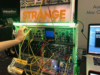
Max Keene showed off the Strange Electronic (@strangeelectronic) Lightstorm Module, synchronizing LED light strips and such via CV. The Kickstarter for the module and the Eurorack case that lights up is going on at the time of this writing. Later, I dropped by again. Henry Strange and I chatted for a bit, including showing their upcoming Strange Mic Controller, in development: a microphone attachment with sensors and buttons to allow the singer to control remote resources, e.g., adjusting vocal effects during the performance.

Max Keene of Strange Electronic  strangeelectronic demoing the Lightstorm module using CV to control LED light strips at Synthplex 2019

They shared the iConnectivity (@iConnectMIDI) booth. I’d been looking at the mio10 for some MIDI routing without the computer acting as a relay. Al Joelson from iConnectivity was helpful in answering questions. Henry Strange also suggested considering the iConnectMIDI4+ (that includes audio pass-thru) and can quickly be expanded using the USB host ports.Good mention by both Strange & used by Electronic Creatives (@electroniccreatives). I may still end up with the mio10 given the number of MIDI ports that may need routing at once to start.

Voltage Modular  cherryaudio software modular synth at Synthplex 2019

I stopped by the Voltage Modular booth to see what they were up to and also because James Terris (@jamesterris) was helping out. He helped with their sound design. Voltage Modular is a virtual modular synth with third parties also developing new modules. I talked a little about the possibilities and interest in allowing modules to be developed in languages other than Java. Of course, it also reminded me of VCV Rack. Now, there are two options to send people to consider when interested in modular synths on the software side. James also designed some of the patches for the Sequential Prophet X.

Missed talking with a variety of exhibitors I had intended to see, including Moog folk (@moogmusicinc), Earthquaker Devices (@EarthQuakerDev), Roger Linn (@roger_linn), Keith McMillen Instruments (@keithmcmillen) and others. I had also intended to chat with the ASMAC (@ASCMAClosangeles)—American Society of Music Arrangers & Composers—folk and finally join. At NAMM 2018, I had talked with Kim Richmond about music notation fonts I’m designing; he also mentioned joining ASMAC. I did finally manage to visit @The_SCL (The Society of Composers & Lyricists) booth, though had meant to drop by earlier. I am a member, but usually only get to physically attend an event near NAMM and watch others from afar. Had a nice chat on Sunday with Chris Wirsig (@nocarriermusic) for a bit about current television and scores. My Slanted Hall fontsAlas, I missed talking with the Alliance for Women Film Composers (@TheAWFC) Women in Film Scoring but will pass them along to other composers. SST (Synthesizer Systems Technologies) was also there and provided some of the loaner synths for presentations.

For those with whom I didn’t chat, I was wearing t-shirts with my Slanted Hall (@slantedhall) typeface designs. All of the fonts, including the in-progress music notation fonts, were drawn by me.

Other posts about Synthplex:

Of course, I left out best parts: conversations and connecting with folk outside of sessions. Always my favorite part of any gathering or conference. Hope to continue those discussions. Stay in touch and let me know when you might be up in the SF bay area, California, USA or are up for collaborating.

Please let me know if any corrections are needed. I look forward to seeing folk at future music and synth gatherings and gigs.

Hopefully, next time, Cary Roberts (@retrosynth) will be able to attend—he was traveling that weekend—along with some other synth folk we know from the bay area and beyond. I think Brandon Daniel (@bdu808), Elaine Walker (@ewalker, ZIA, electronics, vertical keyboards,  & microtonal music), and others might enjoy attending, also.

Now, back to working on new music, typeface designs, choreography for a new musical, creating new synth tools, font editor/tools coding, and preparing to record new compositions.

Jeff Kellem (@composerjk / @slantedhall)
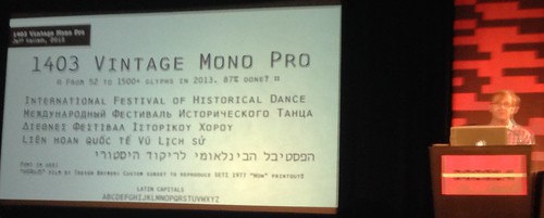
1403 Vintage Mono Pro typeface specimen

Posted in conference, music notation, synthesizers, synthplex, synths, tripreport | Tagged , | Leave a comment

TypeCon 2018 Conference Trip Report

[ The Call for Papers is out for TypeCon 2019, 28 August–1 September 2019, in Minneapolis, MN. Submission deadline has been extended to Saturday, 16 March 2019, 11:59pm EST. Read the Submission Guidelines [PDF] for useful tips. ]

The 20th anniversary TypeCon (@typecon / @typesociety) was held in Portland, Oregon, USA, 1–5 August 2018 at the Hilton Portland Downtown. I had to miss parts of Saturday and Sunday, including most of the evening socials, due to Crohn’s related issues. The past few months have been hectic, so the write-up is bit less detailed. I just uploaded photos of the conference and will try to add notes in due time.

Jump to: WednesdayThursdayFridaySaturdaySundayType Crit,
Louise Fili & Carol Wahler SOTA Award,
Frida Medrano SOTA Catalyst Award,
Links (write-ups, presentations, photos)Feedback.

Tuesday: Driving to TypeCon & an unexpected singing, 27 August 2018

Unexpectedly, I sang in a barbershop chorus rehearsal. After a long, all-day drive, I arrived at a friend’s place just south of Portland on Tuesday evening, just in time to head up to Portland with him before his Bridge Town Sound men’s barbershop chorus rehearsal. I wanted to hear a bit of the rehearsal before heading back to the hotel to rest. They plopped a binder in front of me. But, I was just planning to sit and listen for bit, I responded. It had been a good 25 years since I sang regularly, so my vocal cords were out of shape. I decided to join for just a little while, but ended up staying for the entire rehearsal. When I sang in a mixed choir or solo, my role was baritone/bass. John sings baritone, but in a men’s barbershop chorus, the baritone part is like the alto harmony of a mixed chorus. I wanted to hear John sing, again, so I went further out of my comfort zone and sang in his section. I can mimic, quickly, and read music, so it worked out well though I had never sung barbershop. And was quite fun to just jump in. If I lived in Portland, I suspect I’d consider auditioning to join them. A good group of folk.

Wednesday: Workshops, 28 August 2018

On Wednesday, I caught up with Georg Seifert (@schriftgestalt) & Rainer Scheichelbauer (@mekkablue) of Glyphs (@glyphsapp) for lunch at HOTLIPS Pizza (@HOTLIPSpizza)—good pizza—near the Pacific Northwest College of Art (@PNCA), where the workshops were being held.

Then, I sat in to help out with their workshop Create a Variable Font Animation in Glyphs. If you have any interest in variable fonts, consider watching his Sunday talk Yes, but can Variable Fonts do this? [video]

I would have loved to have attended the Thursday workshops, such as Meir Sadan’s (@meirsadan) workshop on Hebrew Writing (check out his Hebrew Type Club for useful resources and workshops) and Aaron Bell’s (@aaronbell) workshop ㄱ to ㅎ: An Intro to Hangul Design, but I was already booked to attend the Type & Design Education Forum.

Thursday: Type & Design Education Forum, 29 August 2018

SOTA (@typesociety) board member Sharon Olga opened the Education Forum. Patrick Gosnell (@Patrick_Gosnell) talked about the lasting influence of Claudia Röschmann (@claudsdesign) followed by Matthew Edgar showing parts of Ken Garland’s life and influence in Structure & Substance. Renée Seward shared about her research in addressing literacy through typography and visual design (@SeeWordReading).

Before lunch, Lauren Meranda (@LAMeranda), a professor at Judson University, talked about Coaxing a Thesis Topic with an “aim to empower them to create culture, not just mimic it.

Oswin Tickler (@weareSMALLFURY) & Briar Levit (@BriarMade) showed their exploration of collaboration between graphic design students at London College of Communication (UK) and Portland State University (USA) in Similarly Different: Cultures of Collaboration.

Yvonne Cao of TCU (@TCU) showed her work in helping students understand the issues and thinking that goes into branding across cultures in West Meets East: Exploration in Cross-cultural Branding.

TypeCon 2018 Portland

Jan Ballard (@ProfessorJan) of TCU (@TCU) show projects in Rebanding Small Businesses in the Face of Community Gentrification that created new branding that respected the duality of cultures each represented and also helped the students become more “active members of their surrounding community.”

Annabelle Gould of UW Seattle showed work and projects from her class Combining Type + Image / Interpreting Constitutional Amendments, asking students to design a poster interpreting one of the U.S. Consitutional Amendments to “remind people of its original purpose and importance, raise awareness about a particular issue related to the amendment, or call for a change to the amendment itself.” Intended audience was fellow students on campus.

Annabelle Gould also talked about the AIGA Design Teaching Resource, “a peer-populated platform for educators to share assignments, teaching materials, outcomes, and project reflections.” A project of the AIGA Design Educators Community (@aigadec).

Graham Bradley (@grahamwbradley) shared his experience incorporating Testing in Type Design Education as part of his typeface design class at Type@Cooper West—now, Type West at the Letterform Archive (@Lett_Arc) in San Francisco, California, USA. “Python scripts were written to create the visuals.”

TypeCon 2018 Portland

In From Characters to Page Systems in Upper & lower case, Michael Stinson of TypeEd (@TypeEd) & Emily Atwood (@_therealemily) tasked their students to redesign a U&lc magazine article in a way “that reflects their generation.” Scans of the old U&lc issues.

Meaghan Dee (@meagdee) talked about The Role of Hand-Lettering in a Contemporary Design Curriculum that is ”pivoting toward interaction and web design” in the Visual Communication Design department at Virginia Tech.

Taekyeom Lee (@taekyeom) of Appalachian State University in Boone, North Carolina, USA showed some of hte work of his students creating 3D modular type, type furniture, and interactive environmental graphics in Typography with Digital Fabrication.

Richard Kegler (@rkegler) of P22 Type Foundry (@P22TypeFoundry) talked about the workshops with team projects Building Modular Alphabets on the Press using the P22 Blox system they developed.

Thursday: Keynote: Gemma O’Brien

Australian lettering artist and illustrator Gemma O’Brien (@mrseaves) talked about her history and experience, walked us through some of her portfolio and demonstrated live some of the techniques she uses. Fun and interesting.

I was able to drop by the Future Fonts (@futurefonts) and Graphc Means afterparty at Outlet. Good to see some friends and good work of Portland’s creative community. In addition to an old working Apple Macintosh, the had my friends’ Evil Mad Scientist Laboratories (@EMSL) AxiDraw V3 pen plotter set up and being used at the party.

Friday, 30 August 2018: Conference starts

TypeCon 2018 Portland

Lila Symons opened the main program with #FontsMadeByWomen: A Look Into the Typefaces Created and Developed by Women at Hallmark, showcasing some of the wonderful women designers throughout the history of Hallmark and sharing how collaborations with the other female artists and makers “have inspired her own lettering and font work both as a developer and lettering source.” Nice to see the great work done by those illustrators, designers, and lettering artists.

Gloria Kondrup of the Hoffmitz Milken Center for Typography (@hmctartcenter) showed work on the exhibition FEMINAE: Typographic Voices of Women, by Women of political posters over the past 50 years from the Center for the Study of Political Graphics archives. “Artists include Barbara Kruger, Sister Corita Kent, the Guerilla Girls, and others from the US, Mexico, Europe and Australia.”

In Neon: Letters from the Night Sky, Randall Ann Homan and Al Barca (@sfneonbook) took us on a tour of neon sign survivors in the western United States. They documented San Francisco’s 200+ legacy neon signs in San Francisco Neon: Survivors and Lost Icons (2014) and give neon tours in SF.

Glenn Fleishman (@glennf) provided a tour of two typographic archives—St Bride Library (@stbridelibrary) and The Type Archive (@thetypearchive)—in London’s Hidden Typographic Archives.

Keynote: Louise Fili (@louisefili) showed some of her extensive design work and process. Lots of nice detail in her designs. I especially like how she shapes the colophon and copyright pages, in a way appropriate to the book. Check the some example copyright pages on her site.

Bill Moran & Jim Moran of the Hamilton Wood Type & Printing Museum (@hamiltonwoodtyp) show some of the amazing detail work done in space typically smaller than 1 inch square in Renaissance Wood Type & The Grammar of Ornament. As part of their mission to preserve the art of letterpress, they are also “cutting new wood type from these historical models.”

Amy Redmond (@amadapress) shared her adventure in identifying the source of type and “the techniques she used to unearth the true identities of its family members” while reviewing inventory of Stern & Faye Printers metal house face, Futura, in Hello My Name Is… Most Likely Not Futura (A Letterpress Adventure in Metal Type Identification).

In Typographic + Printing Renegades, Nancy Bernardo (@dec_debris) talked about “the role of the early 20th century printer as designer, punchcutters such as Herman Ihlenberg, and how these early renegades have influenced the type and design landscape of today.”

Kris Sowersby (@klimtypefoundry) explored “concepts of originality and authorship” in Ten Thousand Original Copies. [video

Aaron Bell (@sajatype, @aaronbell), Jess McCarty (@sectiontype, @magpiepaper), & Erin McLaughlin (@hindirinny, @fontwala) shared experiences about their fun project Titles in Translation [video], in which they “embarked on a weekly challenge to translate iconic film title designs from around the globe.”

Craig Welsh explored Industrial Chimney Lettering, incuding reviewing the historical aspects of how they were made, using archival engineering drawings, and “how a digital version of industrial chimney lettering has been optically adjusted to consider the proportions of the ‘face’ (outer surface) of the bricks and mortar thickness (joints between bricks).” The digital design work for the resultant Stack typeface was done by James Hultquist-Todd (@jtdtype).

TypeCon 2018 Portland

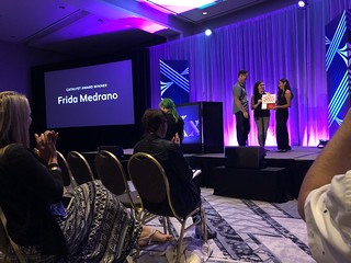
The 2018 SOTA Catalyst Award was presented to Frida Medrano (@fridaemg) of Nuevo León, México. Read about her good work on the awards page.

Jessica Hische (@jessicahische) gave a special presentation to premiere the animated trailer for her children’s book, Tomorrow I’ll Be Brave. 

Saturday, 31 August 2018

Paul D. Hunt (@pauldhunt) talked about the history and “evolution of writing, from hieroglyphics to our modern text+emoji hybrid system” in Language, Culture, Emoji.

Mary Catherine Pflug (@mcpflugie) shared the Results of the 2018 Font Purchasing Habits Survey. [video]

 Jean François Porchez (@typofonderie) talked about his experience and work in designing custom typefaces for recognizable brands in The Visible Invisibility of Words.

Travis Kochel (@traviskochel) & Lizy Gershenzon (@lizyjoy) of Scribble Tone (@scribbletone) talked about what they’ve learned in creating Future Fonts (@futurefonts), exploring risk taking and learning from mistakes.

TypeCon 2018 Portland

Qiu Yin & Ming Wei of FounderType (@FounderType) showed information about Chinese typeface design and font design companies in Status Quo of the Font Industry in China.

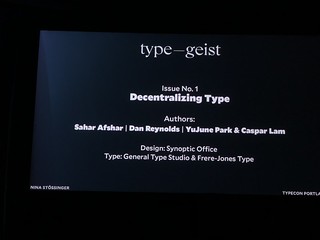
Keynote: Nina Stössinger (@ninastoessinger). In addition to showing her story and interesting path to type design, Nina presented her new publication Typegeist (@TDC_Typegeist), launched with the Type Directors Club (@typedirectors). Here’s the TDC announcement.

In Heavy Metal Type, Sergio Trujillo explored the type in heavy metal album designs, along with its influence of 1960s era psychedlic album covers. I should remember to share some of the metal and hardcore bands I knew in Boston in the 1990s. Some used my photos on their albums and tour posters.

In Hoitech [video], Sami Kortemäki and Akiem Helmling of Underware (@underware) explored design space thoughts in variable fonts. “So what is a design space actually really about? And what if there is no space at all?”

Lynne Yun (@lynneyun) shared the research and practice she did in Reviving a Calligraphy Hand after running across a gothic cursive from the 1600s.

In Writing Systems of the World: What the ▯▯▯▯ is going on?, Zachary Scheuren (@zacharyscheuren) presented “an overview of world scripts and the common problems that keep some scripts from being used. We will then look at what needs to be done to remedy this and how everyone can help.” I have some similar motivation for working with communities whose writing systems have little to no support with fonts and technology, developing new fonts, tools, education, and resources while advocating future design within the communities.

Matthew Wine (@lettersandliquor) showed the results of his exploration into cocktail ephemera in Letters and Liquor: a Typographic History of Cocktails.

SOTA’s Night of Type

TypeCon 2018 Portland

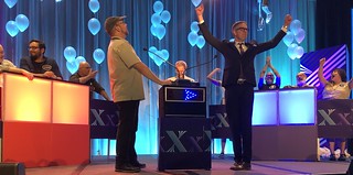
The evening Type Quiz turned into TypeCon Font Family Feud, hosted by Alan Haley and Rachel Elnar. The SOTA Typography Award Ceremony was also held, then. The 2018 award was presented to designer Louise Fili (@louisefili) and executive director of the Type Directors Club Carol Wahler. Well deserved.

Sunday, 1 September 2018

Jess McCarty (@magpiepaper) talked about how good customer service can help set one apart and build a brand in Stop Being an Internet A**hole: Radical Ideas for Winning Customers and Making Money in a Crowded Marketplace [transcript/slides]. She put together a useful set of resources.

TypeCon 2018 Portland

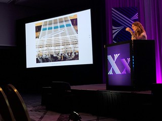
Aoife Mooney (@aoifemooney) shared her experience learning to weave and how that process inspired a typeface in Textura: The Woven Word (or typographic texture: woven language).

Dave Crossland (@davelab6) showed the open source quality assurance (QA) tool Font Bakery [slides] along with its development history, implementation details, and future needs of the project.

Rainer Erich Scheichelbauer (@mekkablue) of Glyphs (@glyphsapp) and Schriftlabor (@schriftlabor) presented live coding of variable fonts and OpenType Variations in Yes, but can Variable Fonts do this? [video] He started with showing the Eadweard Muybridge Sallie Gardner at a Gallop, aka Horse in Motion, (1878) series of photographs as a variable font.

TypeCon 2018 Portland

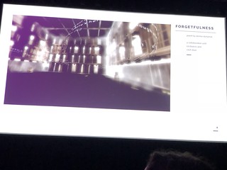
Meaghan Dee (@meagdee) explored the use of Typography for Immersive, Mixed, and Virtual Environments. She showed Shakespeare’s Garden: An Immersive Sound Stroll Through His Sonnets, Soliloquies, and Scenes, futureHAUSand “a virtual reality piece on the poem Forgetfulness, by Denise Duhamel.”

Radek Sidun (@radeksidun) showed some of the fun results of students from the semester research project on variable fonts at the UMPRUM Academy (@UMPRUMKAType Design and Typography studio in Prague, Czech Republic.

Keynote: Lauren Hom (@homtweethom) started off her story with asking what would happen if you asked for what you wanted? and proposing that passion projects never stop working for you.

TypeCon 2018 Portland

Type Crit

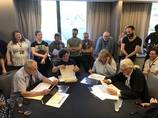
One of my favorite aspects of TypeCon is the Type Crit. A type designer gets 10 minutes of quick critique with three master type designers: Matthew Carter, John Downer, & Jill Pichotta (@jillpichotta).

This year’s crop of critique signups included new fonts in progress by:

Other Posts about TypeCon

When I have a little more time, I may add more links to other posts about TypeCon 2018 here. Let me know of any that I missed.

Here are some other posts about TypeCon 2018:

Photos:

Presentations:

My TypeCon trip reports:

Please let me know if any corrections are needed. I look forward to seeing folk at future type gatherings. I do try to attend TypeThursday (@TypeThursdaySF) at the San Francisco Center for the Book (@sfcb), at least.  Come talk with me about typeface design (+ music notation fonts) and tools development!


 —Jeff Kellem (@composerjk / @slantedhall)
1403 Vintage Mono Pro typeface specimen

Posted in conference, tripreport, typecon, typecon2018, typeface, typography | Tagged , , , , | Leave a comment

TypeCon 2017 Conference Trip Report

TypeCon (@typecon / @typesociety) was held in Boston, Massachusetts, USA, 23–27 August 2017 at the Boston Park Plaza hotel. I believe attendance was around 400.

Jeff with long hair. Portrait by Rachel Rausch Johnson

Unexpected connections and overlap: Bob Colby, who founded TypeCon, attended. He’s from the Boston area. I kept thinking he looked familiar. Oh, right. We were both at various Boston rock shows in the early to mid 1990s, when I was part of the Boston music scene. And we have at least one good friend in common, whom I had just spoken to earlier the same day. While Delve Withrington (@delvefonts) and I were walking back from MassArt after the Wednesday evening talk by Alex Trochut, we realized we had also lived in Boston and were likely at some of the same local concerts. I was out at shows 5–7 nights a week, taking photos of performing musicians. I had long hair back then, so it may be easy to not recognize me.

Jump to: WednesdayThursdayFridaySaturdaySundayType Crit,
Paula Scher SOTA AwardRamakrishna Saiteja SOTA Catalyst Award,
KeynoteLinks (write-ups, presentations, photos)Feedback.

I arrived in Boston very early Tuesday morning. Amazing how my brain knew exactly where to go to navigate the T (metro) to change lines, though it had been 20 years since I had moved away. Immediately upon arrival at the conference hotel, I ran into friends. Georg Seifert of Glyphs (@glyphsapp) and Delve Withrington (@delvefonts) were chatting. After some conversation and grabbing a shower, Georg and I wandered to the nearby Jaho Coffee Roaster & Wine Bar (@jahocoffee) to catch up and talk about projects.

As part of catching up with friends in Boston, I dropped by WMBR 88.1 FM (@wmbr), MIT’s radio station, to visit musician Ken Field (@revsnakeens) during his weekly radio show The New Edge (Tuesdays, 2–4pm ET). Turns out he also had a guest gig with Aperitivo Trio & Friends at The Lilypad (@lilypadinman) in Inman Square, Cambridge, MA that evening. After catching up with a dear friend for dinner, I walked to the fabulous concert. Georg also attended. Aperitivo Trio consisted of Ara Sarkissian (piano), Andy Blickenderfer (bass) and Fabio Pirozzolo (percussion). Guests were Ken Field (saxophone and flute) and Palestinian oud player Basel Zayed (@basel_zayed). Georg and I walked to Harvard Square. My friend Marah joined us for a late dinner.

Wednesday: Workshops, 23 August 2017

On Wednesday, I sat in on the Glyphs workshops to help out. While locating the workshops, I met Chiharu Tanaka, another bay area type designer, working with PSY/OPS Type Foundry (@psyopstype). It was also wonderful to run into Qiu Yin and Ming Wei from FounderType (@foundertype), China, again. The morning was on TrueType Hinting in Glyphs: Optimize Your TTFs for the Screen with Lisa Schultz (@chofrosubo) of Schriftlabor (@schriftlabor). An Open Feedback Session: Q & A with the Developer of Glyphs with Georg Seifert (@glyphsapp) followed in the afternoon. It was fun to catch up with James Grisehaber (@typeco), talking about type, Glyphs, wood type, and P22 (@P22TypeFoundry).

Wednesday evening: Alex Trochut (@alextrochut) talked about his creative process in Non-verbal Communication and the Written Medium at MassArt (@MassArt), presented by the Type Directors Club (@typedirectors).

Thursday: Type & Design Education Forum, 24 August 2017

Constanza Pacher talked about The Role of Experimentation in Teaching and Learning Typography, sharing some of the student typography projects that explored “non-linear representations of the text with the goal of enriching the reading.” Future plans include incorporating more language and linguistics into the Typography II class of MacEwan University’s Design Studies program (@MacEwanU).

In Flexing Rather Than Finding Your Typographic MuscleAoife Mooney (@aoifemooney), the North America coordinator for International Society of Typograhic Designers (@ISTDworldwide), and Jillian Coorey (@jscoorey), both of Kent State University (@VCDKent) talked about how they used the ISTD student assessment briefs in their own teaching curriculum. The 2018 briefs are available now with assessment planned for 13 April 2018. The article they both wrote on Building a global community of typographic practice (on @Typographica) is worth a read and goes into more detail.

Tyler Galloway talked about applying Postman and Weingartner’s “inquiry method” (from their book Teaching as a Subversive Activity published in 1969) to undergraduate graphic design study. “Learning by questioning, students pursue their own discovery.”

Yoon Soo Lee talked about Mud Pies, Critical Thinking, and the Addiction of Aesthetics. “A mud pie is image making without a goal. First rule of mud pies: postpone judgment. Second rule of mud pies: quantity is my friend. Third rule of mud pies: there are no rules. Really. There are no rules. It’s a mud pie.”

Jean François Porchez (@jfporchez) & Stéphane Elbaz (@stephaneelbaz) talked about creating TypeParis (@TypeParis) in Designing a Typeface Design Programme. “We revisited the long tradition of type design study that started in France in the 1970s to design a summer course. The idea is to fill the gap between one year programmes and short workshops. The programme is in English and mixes traditional drawing and calligraphy techniques, type history, and modern software practices.” Here’s Q&A with three TypeParis 2016 attendees—Andreas Nymark (@andreasnymark), Jocelyn Anderson (@jocelynand_) and Kenneth Ormandy (@kennethormandy)—asking “What did you learn at TypeParis?

In Counter-space: Finding Creativity Within the DetailsAndrea Leksen (@leksendesign) talked about integrating “the important typographic details with an exploration of creativity within type” in her typography curriculum. Early on, students created an illustrative initial cap that used imagery to match the meaning of the body text. The students created some fun initial caps that helped in telling the story and would be nice to see set in books.

I missed some of the talks due to good conversations with old friends. I was especially sad to miss a couple talks at the end of the day: Meta Newhouse’s (@metanew) presentation on Tipo e Cinema since it involved the Tipoteca Italiana Museum (@Tipoteca) archives that I hope to explore, someday; and, Carolina de Bartolo’s (@carodebartolo) talk on the redesign of the second edition of Explorations in Typography.

TypeCon 2017 Keynote speaker Martina Flor Thursday: Keynote with Martina Flor!

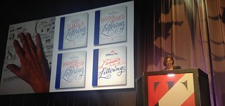
It’s always fun to hear Martina Flor (@martinaflor) speak. Great to have her opening the conference showing some of the projects she created—e.g., postcards as marketing, Lettering vs. Calligraphy, and The Golden Secrets of Lettering book (available in German, Spanish, and English with French on the way)—and commissioned projects such as Spanish publishing house Austral’s (@Austral_edAlice in Wonderland. There were also samples of her lovely ampersand pins in the SOTA store.

Friday, 25 August 2017: Conference starts TypeCon 2017 Bruce Kennett on W A Dwiggins Hermann Püterschein and the Fictional Society of Calligraphers

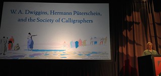
Bruce Kennett (@WADwiggins) gave some insight into William Addison Dwiggins in his talk W. A. Dwiggins, Hermann Püterschein, and the Fictional Society of Calligraphers. His book W. A. Dwiggins: A Life in Design, published by the Letterform Archive, looks to be fabulous. I saw some of the proofs during a visit. This is the first of books the Archive will be publishing. There are already a couple of other wonderful books in the pipeline that you will want to have in your library.

NOTE: The Dwiggins Publication Party reception is on Friday, 23 March 2018, 6:30–8:30pm at the Letterform Archive (@Lett_Arc)

https://twitter.com/ninastoessinger/status/901079403903557637

Tucker McLachlan (@tuckermclachlan) talked about “design histories we might prefer not to tell, when typographic practices have served the aims of white supremacy, colonization and genocide. From slave passes and police uniforms to royal charters and reservation boundaries, design and dispossession remain forcefully intertwined.” in Typography Ghost Stories.

TypeCon 2017 Petra Dočekalová on New Lettering FormsPetra Dočekalová (@docekalovapetra) explored sign painting in New Lettering Forms and has attempted to “breathe some life into the field” in the Czech Republic.

TypeCon 2017 Catherine Leigh Schmidt on Yatra A Journey in Painted SignsCatherine Leigh Schmidt (@cathschmidt) continued on the topic of sign painting with a focus on Devanagari in Yatra: A Journey in Painted Signs, showing the journey taken to design Yatra, “a display Devanagari and Latin typeface inspired by the hand-lettering styles of the Mumbai local rail.” Read about The Story of Yatra in TYPE magazine (@TYPEmag_org) issue 1 and see the Yatra One typeface on Google Fonts (@googlefonts).

Catherine also recommended the 33-minute documentary Horn Please on the truck art of India and mentioned the Hand Painted Type project to document and digitize the work of sign painters around India. I also wrote down a note that she would like to talk with tech folk about curved Devanagari, but I did not have a chance to talk with her about it.

TypeCon 2017 David Jonathan Ross on EXTRA EXTRAIn EXTRA! EXTRA!, David Jonathan Ross (@djrrb) explored what happens when letterforms are pushed to extremes, showing historical and contemporary examples, ending with the design of his typeface Fit, “designed expressly to fill space with panache.” In early 2018, in collaboration with Oded Ezer (@OdedEzer), David released Fit Hebrew. Thanks for the shout out for my 1403 Vintage Mono typeface. One of the aspects of my in-progress Filmotype Gemini typeface revival is adding alternates to fit letters together.

Scott Boms (@scottboms) explored the Risograph and its use at Facebook’s Analog Research Lab (@analoglab) in Imperfection Machines: Low Res in a High Res World, showing how the rising popularity of this obsolete device is bringing “creative expressions of typography and design to new audiences.” They hold classes each week on the Risograph. An eraser can be used to get rid of track marks.

In Dr. Strangefont or: How I Stopped Worrying and Learned to Make Chromatic Type, Geri McCormick & James Grieshaber (@typeco) talked about the process of learning to make chromic wood type along with showing a brief history and the process used to make new wood type, today, at Virgin Wood Type.

In Cultivating Creative Communities, Rachel Elnar of TypeEd (@TypeEd) talked about building community around type and design, along with the “challenges of developing in-person events in a sprawling city” such as Los Angeles, California, USA. Rachel has also helped organize the TypeThursday events in Los Angeles (@TypeThursdayLA).

TypeCon 2017 SOTA Catalyst Award Ramakrishna SaitejaThe 2017 SOTA Catalyst Award was presented to Ramakrishna Saiteja (@rama_kst). I had some good conversations with Rama over the couple days prior to the award presentation.

I ended up staying a bit later at the SOTA Spacebar social gathering which meant missing the screening of the film Graphic Means: A History of Graphic Design Production (@graphic_means). Since I helped fund the project, I have a copy of the film at home. There are a couple screenings in San Francisco, California at the end of March 2018. Expected availability to purchase is in May 2018. Many good conversations happened on the rooftop. Andrea Leksen (@leksendesign) and I even danced a bit of tango fusion mix.

Saturday, 26 August 2017

In Thinking and Practicing Chinese Type Design on Screen, Qui Yin & Ming Wei of FounderType (@FounderType) talked about how Chinese type design has been changing with the advent of high resolution displays. FounderType also recently published a book on Chinese typefaces, 中文字体应用手册 published by 广西师范大学出版社. 方正字库(1986-2017) Foundertype. My copy arrived in February 2018.

Mark Jamra & Neil Patel (@neilspatel) of JamraPatel (@JamraPatel) talked about Lessons Learned in Designing Type for Africa from their experience designing typefaces for African scripts—N’ko, Ge’ez, Vai, Adlam, & Tifinagh—and localizing software for African markets. The slides from their presentation (and others related to their African type design work) are online.

TypeCon 2017 Richard Kahwagi on Arabic Typography and Popular CultureIn Arabic Typography and Popular Culture, Richard Kahwagi showed samples of how popular culture typography was adjusted when translated to Arabic, including examples such as the FedEx logo, 7 Up, Superman, and Mickey Mouse.

In Fundamentals of Japanese Metrics Editing, Masataka Hattori talked about the differences in font metrics between Japanese and Western glyphs, issues to be addressed, with hints provided for typeface designers and font design tool developers. The Pan-CJK typeface family Source Han Sans, co-developed by Adobe and Google, was used to show practical examples.

Alas, on Saturday, my body was acting up with a partial bowel obstruction related to my Crohn’s Disease. So, I had to miss various talks and talking with people, resting much of the day. I did manage to catch the second half of the The Infamous Type Quiz & Silent Auction, though I still wasn’t feeling great. Luckily, things cleared overnight, so I was able to attend more on Sunday. Thanks to some good friends on Saturday.

Sunday, 27 August 2017

Jason Pamental (@jpamental) explored Variable Fonts and The Future of Web Design (slides available plus video of the talk from another conference). It’s worth hearing and reading Jason’s thoughts on using fonts on the web.

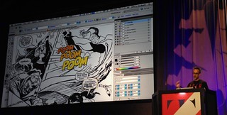
TypeCon 2017 John Roshell on ZAP POW BAM Comic Book Lettering from Pens to PixelsIn ZAP! POW! BAM! Comic Book Lettering, From Pens to Pixels, John Roshell (@jgroshell) talked about his experience designing typefaces for comic books. He’s currently going crazy with Chinese and Japanese editions. John is also “hanging onto Fontographer with clenched fists.”

Radek Sidun (@radeksidun) presented an overview of Czech Typefaces for Television from “the 1960s until today, showing original typeface designs, archive materials and current approaches.” One of the things one has to handle, especially with older CRT (Cathode Ray Tube) TV technology, is blooming, so techniques similar to inktraps are used. A fun thing shown was how they ended up using videos of kittens during station breaks. His Briefcase Type Foundry (@briefcasetype) article on Czech Typefaces for Television includes more photos and detail.

During The Rise of Typographic Tattoos, Ina Saltz (@typegal) showed examples of typographic tattoos collected over the past decade and published in two books by Abrams Image (@abramsbooks): Body Type: Intimate Messages Etched in Flesh and Body Type 2: More Typographic Tattoos. Through photographs and interviews, the reasons why people chose them and what makes for a good typographic tattoo were presented.

Doug Wilson (@realdougwilson) showed clips “clips from vintage printing, typography, and journalism films” in the PrintingFilms.com collection he established “in 2012 after his work as director of Linotype: The Film (@linotypefilm).” Doug also used my 1403 Vintage Mono typeface throughout the presentation.

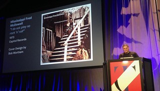
TypeCon 2017 Jason Campbell on Mojo s Workin Blues Typography  Album ArtIn Mojo’s Workin’: Blues Typography & Album Art, Jason Campbell (@campbellgraphic) walked us through the history of blues music album covers from the 1920s through today, with a focus on typographic design.

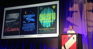
TypeCon 2017 James Walker on Type Hike A Typographic Exploration of America s National ParksJames Walker (@wwwalker_james) talked about the non-profit collaborative design project Type Hike: A Typographic Exploration of America’s National Parks that he and David Rygiol started in 2016.

Type Crit

One of my favorite aspects of TypeCon is the Type Crit. A type designer gets 10 minutes of quick critique with three master type designers: Akira KobayashiJohn Downer, & Jill Pichotta (@jillpichotta).

I’ll try to dig up the names of those who showed typefaces for feedback. In the meanwhile, you can see some of my photos of the Type Crit on flickr.

Fun and informative, as always.

The closing night party was the TypeCon x Dribbble Meetup at District Hall, an interesting event and workspace with a free public lounge encouraging innovation and creative endeavors. Plus, there’s the attached Brew Cafe for food and drinks. If I still lived in Boston, I suspect I’d end up there periodically to work on my type design projects. During the party, the had a blind trivia contest and encouraged people to create drawings that represented Boston. I ended up winning the reproduction of the lovely book Specimens of Chromatic Wood Type, Borders, &c.: The 1874 Masterpiece of Colorful Typography by @Rizzoli_Books. Though nicely large, it’s still smaller than the original.

Other Posts about TypeCon

When I have a little more time, I’ll add more links to other posts about TypeCon 2017 here.

Here are some other posts about TypeCon 2017:

Photos:

Presentations:

My TypeCon trip reports:

Please let me know if any corrections are needed. I look forward to seeing folk at future type gatherings. I do try to attend TypeThursday (@TypeThursdaySF) at the San Francisco Center for the Book (@sfcb), at least. I will also be at TYPO Labs 2018. Come talk with me about typeface design (+ music notation fonts) and tools development!

Jeff Kellem (@composerjk / @slantedhall)
1403 Vintage Mono Pro typeface specimen
Posted in atypi, conference, presentation, tripreport, typecon, typecon2017, typeface, typography | Tagged , , , | Leave a comment

Inspirational talk on ADLaM—An African Alphabet Adventure

ADLaM script in use

Some days, there are too many overlapping events. On Thursday, 15 February 2018, there were at least three:

3rd ADLaM Conference January 2018 in Mamou, GuineaI ended up at the IMUG presentation on the ADLaM script. Craig Cornelius gave an introduction to the script and its history with stories of how he got involved plus his recent attendance at the 3rd ADLaM Conference in Mamou, Guinea, 5–8 January 2018. Over 800 people attended the conference from the Democratic Republic of the Congo to Mauritania and Chad to Liberia, plus Angola, Kuwait, Belgium, Spain, USA, and beyond. After Craig’s presentation, Ibrahima & Abdoulaye Barry (creators of the ADLaM script) joined in via video chat for the question and answer part of the evening. They started creating the script in 1989 when they were ages 10 and 14.

The presentation and discussion were inspirational. The ADLaM script seems effective in teaching how to read and write Fulani/Pulaar and has potential to improve literacy for millions. Its use has spread across Africa and seems to be gaining momentum among the Fulbe people. The script can also be used for other African languages. One of the advantages over Latin and Arabic script (both currently used to write various African languages) is that ADLaM represents some of the sounds unique to those languages with less ambiguity. At some point, I may design some ADLaM typefaces.

Some of the current challenges:

  • convert existing ADLaM writing from the old encodings to the new Unicode encodings.
  • technology integration of ADLaM script, keyboard, and fonts support.
    • Operating system support: Google has started support. I don’t know Apple’s, Microsoft’s, nor Unix systems plans.
    • Support in apps and web apps, especially when base OS doesn’t yet support the script.
  • design more fonts and styles.

I suspect that eventually Richard Ishida (@r12a) will add ADLaM to his tools for various scripts, like he has for N’Ko (script summary, character picker, and character notes) and many other scripts. View the ADLaM Unicode block in his UniView tool.

Adlam availability from Google:

  • Android 8.0 & standard Chromebook release Q4 2017+ include Noto Sans Adlam font.
  • GBoard Adlam keyboard available as of December 2017.
  • Supported in Google Input tools extension for any Chrome browser window (any computer) and Chromebooks.

It was fun to see familiar names as part of the story, some unexpectedly, like mention of Stephen Rapp helping connect the Barry brothers to the Unicode Consortium (@unicode) by way of Deborah Anderson of UC Berkeley’s Script Encoding Initiative at the 2013 Lettering Arts/Calligraphy Conference in Colorado Springs, Colorado, USA. Coincidentally, on the same day of this ADLaM talk I attended on 15 February 2018, Deborah Anderson was presenting a Sawyer Seminar on Preserving the World’s Languages and Cultures (through character encoding) at the Institute for Comparative Literature and Society at Columbia University (@ICLSColumbia).

Craig Cornelius also has worked with the Cherokee Nation on their script. @NPR talked about some of his work in Gmail Sends Message in Cherokee (20 November 2012). Craig also presented some of his work in Indigenous languages and technology—Challenges, standards, & tools for small language communities at the United Nations International Expert Group Meeting on Indigenous Languages (@UN4Indigenous), 19–21 January 2016.

Read and watch more about ADLaM and other African scripts (plus one in Sri Lanka):

IMUG related links:

Jeff Kellem (@composerjk / @slantedhall)
1403 Vintage Mono Pro typeface specimen

Posted in presentation, typography, writing systems | Tagged , , , | Leave a comment

Type Design Conferences

There are a number of great type design & typography related conferences happening around the world, these days. Several conferences coming up include:

Some conferences have video archives of talks. Here are some other type design conferences you might have missed:

Let me know of other type-related conferences you enjoy!

Jeff Kellem (@composerjk / @slantedhall)
1403 Vintage Mono Pro typeface specimen

Posted in atypi, conference, typecon | Tagged , , , | 1 Comment

Shift CTRL 2016 Conference Trip Report

The Shift CTRL (#shiftCTRL)—New Perspectives on Computing and New Media conference was held at Stanford University Humanities on Friday & Saturday, 6–7 May 2016, organized by Thomas S. Mullaney (@tsmullaney). This gathering was a follow-on to the American History Association 2016 Annual Meeting (@AHAhistorians) session Shift Ctrl: Computing and New Media beyond the US and Europe that Tom chaired on 10 January 2016, 11am–1pm EST, in Atlanta, Georgia, USA.

Each session topic included two to three presentations, giving a glimpse into the papers the participants had shared among themselves ahead of time. Afterwards, the presenters gathered at a table to answer grouped questions from the audience. As the discussions happened, the participants found unexpected connections between different areas of work. Some of that is what can happen when presentations are combined like that. A great conference.

My notes were minimal, though I enjoyed all the talks. Squeezing this writing in between my type design work means this trip report will also be minimal with raw notes and links as opposed to nice prose.

One of the challenges of an independent researcher like myself is getting access to resources while being unaffliated with a university. It’s still possible but sometimes requires a bit more effort. This conference reminded me of some of the things I like about a good research community. I will also be looking for funding sources for projects on:

  • the oral history of some type designers related to my past research, and
  • typeface design to support preserving endangered languages and minority languages.
The Shift CTRL conference aligned well with my background in technology development and history. My type design work includes research into history for each script & language, but also for technology used in printing and writing. Some of that research was included in the talks I gave on Resurrecting Type of the IBM 1403 about the mainframe line printer, its use around the world (Iceland’s first computers, Vietnamese land titles & first legal documents printed on computer), and the development of my resultant 1403 Vintage Mono Pro typeface.


Ecologies

Languages & Logics

    • Mention of English only. Though not the same, common language for air traffic control is English. So, all pilots need to know English. Think it would be okay to have programming language with keywords based in another language. The issue comes when one wants to involve others who may not speak that language. Same issue with English-based programming languages.
    • There have been programming languages that were not based in English. If I had more time, I would dig up references. For now, here’s the Wikipedia page on Non-English-based programming languages.
    • Games.
    • Assumptions built into development tools, based on past major games and structure.
    • New meanings to familiar core elements, e.g., collision.
    • Jason Rohrer’s (@jasonrohrerPassage — Two others attending the conference wrote about it, also.
    • Mainichi — an experiment in sharing a personal experience through a game system.
    • Dys4ia — spatial and conversation.
      • layoff and carry(??) life
    • My own note: Are these types of games becoming more common, now, or are we just seeing them more often because of greater connection?
 

Identities

  • Janet Abbate (@JanetAbbateVT), Virginia Tech — Code Switch: Rethinking Computer Expertise as Empowerment
    • How and why we teach computer science is important.
    • mentioned Anita Borg Institute (@anitaborg_org) re: diversity and inclusion. I worked with Anita at the DEC research laboratories back in the 1990s.
    • code.org (@codeorg) — but noted focus on coding and diversity in PR materials, then videos mostly from older white guys. Not getting into what one could do other than program, be successful. (My simplification of her more clear statements.)
    • #YesWeCode (@yeswecode) — founded by Van Jones and musician Prince.

Authorities & Truths

  • Honghong Tinn, Earlham College — Econometric Models and Computers: Manufacturing Economic-Planning Projects in Taiwan
    • “explores the early use of mainframe computers to assist in econometric-knowledge production and economic-project planning in Taiwan in the 1960s.
      … Specifically, this paper explores the computer-assisted production of inter-industrial input-output analysis in Taiwan. Harvard economist Wassily Leontief developed the method in 1941.
      In the case of Taiwan, a Cornell University Professor, Ta-Chung Liu, visited the country in 1964 to help form an economic-planning project. Liu helped a Taiwanese government agency to produce inter-industry input-output analyses of Taiwanese industries with the IBM 1620 computer. The limited capacity of the IBM computer however, hindered the process of producing such analysis. The Taiwanese team, thus, had to reconfigure economic data to accommodate the capacity of the computer. By using Taiwan as an example, this paper reveals the underlying historical tensions and contingencies in visualizing, representing, and making sense of economic activities during the Cold War.”
    • Taiwan 1964–1969
    • Cold War
    • IBM 1620
    • Ta-Chung Liu’s “A Macro-Econometric Model for Taiwan’s Economy,” CIECD, 1965.
    • The Econometric Practice of Ta-Chung Liu [PDF] by Hsiang-Ke Chao and Chao-Hsi Huang, 2010.

Power

  • Nick Montfort (@nickmofo), Massachusetts Institute of Technology — Shifting to Free Software
    • Think argument could be made stronger. Focusing on longevity of access to information (archival and beyond).
    • Same for all tech and archiving.
    • Note that there’s also a risk that free software stops being maintained or requires more work than one is able to put to be able to use again. 

Infrastructures & Economies

 
Liza Loop (@LizaLoopED) mentioned that in 1987 that the way they had copies of a book made in Russia was retyping because copy machines were so regulated. Meant to ask if same for printing presses. I assume so?
 
 
For some reason, I had a note “to Fred Turner: Critical Systems Interdependency & Failure Modes Failure Analysis” referring to the Clinton Presidential Commission Report in the late 1990s. Alas, I do not recall why I wrote that down. So, I’ll just leave a link to PDD-63 on Critical Infrastructure Protection, 22 May 1998.

Final Discussions and Computer History Museum Tour  

Some random quotes during the fabulous Revolution Exhibit tour at the Computer History Museum (@ComputerHistory)…
  • Both Jenna (@jennaburrell) & Janet (@JanetAbbateVT) asked “where’s the Discourse key?” when looking at lovely old computer keyboards. 😉
  • “Innovation under constraints”—Jenna (@jennaburrell)
  • “My Drunk Computer History”—Tom (@tsmullaney)
 
During the Computer History Museum tour, there was only time to explore the Revolution Exhibit. Next time, check out the demo labs:
  • PDP-1 Demo Lab with working demonstrations of the DEC PDP-1 and the Spacewar! game on 1st & 3rd Saturdays, 2:30pm & 3:15pm. Learn about the PDP-1 and restoration and the Spacewar! game.
  • IBM 1401 Demo Lab with working demonstrations of the IBM 1401 mainframe and the IBM 1403 line printer that inspired my 1403 Vintage Mono Pro typeface. Demonstrations in the lab are on Wednesdays at 3pm and Saturdays at 11am. A custom version of my font to more closely match the original printer chain was used in the short film 6EQUJ5, directed by Trevor Brymer, New Zealand. Coincidentally, I worked at both IBM and DEC (Digital Equipment Corporation) research laboratories.
 
The shiftCTRL conference brought together a great group. It sounds like there will be a longer-term publication to bring their ideas together in some cohesive form. One of the goals seems to be to encourage more discourse and research. Some of the things that could be done to foster continuing conversations include:
  • Book, journal of the papers with commentary added to encourage more discussion. An important aspect of the Shift CTRL conference: the discussions that happened after the talks, connecting and exploring the topics presented.
  • Periodic articles, blog posts, etc. in shorter form. Perhaps all linking with the #shiftCTRL as a connector keyword. Note that shiftCTRL may be used for other topics.
  • Continually updated collection of related publications, posts, resources.
  • I believe there was mention of considering ACM Interactions (@interactionsmag). Perhaps Communications of the ACM (@CACMmag) would also be appropriate.
  • Also, perhaps consider IEEE Computer Society’s (@ComputerSociety) Annals of the History of Computing (@computingnow).

Other posts about the ShiftCTRL Conference

Posted in conference, shiftCTRL | Tagged , , | Leave a comment

TypeCon 2015 Conference Trip Report

TypeCon (@typecon / @typesociety) was held in Denver, Colorado, USA, 12–16 August 2015. Though attendance seemed lighter this year, it was another great conference. Lots of good folk, past attendees, and ones at their first TypeCon.

In between TypeCon and finishing up this trip report, the following have happened:

I may have to miss TypeCon this year due to a potential conflict to attend a wedding in Moscow. If I am able to manage that trip, I hope to be able to also extend it to attend ATypI Warsaw 2016. Alas, NAMM Musikmesse Russia is being held at the same time, 15–18 September 2016. It would be fun to attend that, also.
 

Jump to: WednesdayThursdayFridaySaturdaySundayType Crit,
Robert Slimbach SOTA Award, Shiva Nallaperumal SOTA Catalyst Award,
KeynoteLinks (write-ups, presentations, photos)Feedback.

Tuesday, 11 August 2015

After checking into the hotel, I walked a couple miles to catch the latter portion of Kyle Read’s (@kyleread) launch party for his new Badson Studio (@BadsonStudio). Glad to be able to make it there before the end to help him celebrate. Kyle also designed the Local Survival Guide. It was one of the best designs I’ve seen of the local guides for TypeCon. Great job, Kyle!

Wednesday, 12 August 2015

I started the conference off with Rainer Erich Scheichelbauer’s (@mekkablue, @schriftlabor) workshop on Color Fonts with Glyphs. It was fun to see more folk moving to, or considering, Glyphs (@glyphsapp) for their type design work. It’s what I use every day.

Nicholas Felton (@feltron) designed the brand for the 2015 conference. Alas, I had to skip the Type Directors Club (@typedirectors) sponsored event with Nicholas speaking. I had a last minute request to teach an impromptu Mazurka Tango class at the American Vernacular Dance Wednesday Waltz Etcetera at The Avalon Ballroom in Boulder, Colorado. Last minute, meaning I was picked up five minutes after agreeing to teach and teaching the class 20 minutes after arrival in Boulder. Here’s a demonstration video of the Mazurka Tango (aka Mazurka Clandestine) showing some of the style of dance I taught that evening.

Later that night, there were some good conversations with Scott Boms (@scottboms), Luke Dorny (@luxuryluke), and James Todd (@JTDType), until late. I should’ve gone to bed earlier, but it was difficult to leave fun conversation with good folk.

Thursday, 13 August 2015

TypeCon 2015: Cyrillic for Real workshop with Alexandra Korolkova

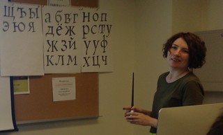
The was a good group of folk in Alexandra Korolkova’s Cyrillic for Real Use workshop, including Chris Lozos (@dezcom), Thomas Phinney (@thomasphinney), Anna Konyuhova, Neil Patel (@neilspatel), and others. Great tips and history about the Cyrillic script. In addition to the useful cheatsheet booklet she gave us, she showed details from previous presentations. A sample of what’s in the booklet can be see in this livejournal post. While practicing drawing Cyrillic, I had my first experience with a pointed pen and learned a little how to use one as a left-hander. Anna wrote about her experience and practice after the conference. 

I heard great things about John Downer’s 2-day workshop on Sign Painters’ Single-Stroke Majuscules and Stephen Rapp’s Expressive Brush Lettering workshop. Some nice photos from both workshops are near the top of Helen Lysen’s TypeCon 2015 photos. I also wish I could have attended Education Forum, but the Cyrillic workshop was not to be missed.

Marian Bantjes’ (@bantjeskeynote was an enjoyable look at her past work and the paths she took. I thought about asking her to talk about her fabulous work on the Tales of the Brothers Grimm book with drawings by Natalie Frank (@nataliepainter4), but figured if she hadn’t mentioned it, there might have been a reason she wasn’t including it. Turns out, it would’ve been fine. Next time, I’ll ask.

The AIGA-sponsored (@aigacolorado) after party was at a large bar with pool tables. I didn’t play pool, though it had come up in conversation the night before.

Conference Talks

Friday, 14 August 2015

Mary Mashburn, of Maryland Institute College of Art [MICA] (@mica_news) and Typecast Press, showed some of the great history of iconic jazz and R&B posters in Life Lessons from Globe Poster, including lovely posters from their collection of B.B.King, Marvin Gaye, Aretha Franklin, and many others. MICA now keeps Globe alive and in production. Some folk I know went to MICA including Erin Ellis (@rrrellis) and Shiva Nallaperumal (@shiva__n). Some of the posters were given as prizes at the Type Quiz.

In Wrong reading: Examples of Double-Sided Wood Type, Jason Wedekind (@genghiskern) provided an overview of pieces collected and the history of some of the double-sided wood type he’d found and researched. Some of the #typetwofers images are on Instagram.

Frank Grießhammer (@kioskfonts) talked about the vector fonts that Dr. A.V. Hershey designed (while at the U.S. Naval Weapons Laboratory in the late 1960s) in The Hershey Fonts [video]. Welcome to my world, Frank. A fun exploration into some of the history and his path to resurrect the Hershey fonts using the original data points combined with modern OpenType font technology. Hershey wrote the technical report Calligraphy for Computers in 1967. Thanks for the shout-out, too.

My first experience with the Hershey fonts was in the X Window System back in the mid-to-late 1980s. I knew or worked with a number of the X Window System developers. I also had re-visited the fonts in the past couple years, thinking I’d convert them to modern outlines. That project can now be crossed off. Frank plans to put his results on Adobe Type’s github. May help, if that makes sense.

In 2011, my friend Windell Oskay (@oskay) of Evil Mad Scientist Laboratories (@emsl) wrote the Hershey Text: An Inkscape extension for engraving fonts (for laser cutters, CNC routers, 3D printers, pen plotters, etc., along with their EggBot). The Hershey Text extension is included in Inkscape version 0.91, as of January 2015.

Joe Galbreath talked about the history and show samples of The Commercial Monograms from the GramLee Collection [at West Virginia University (@wvucca)]. There were some great wood type examples in this presentation.

Scott Boms (@scottboms) moderated a nice panel on Filmotype Junto: The First Font Cooperative by Stuart Sandler of Font Diner (@fontdiner) & Font Bros. (@fontbros). Other panel participants included Lily Feinberg (@lilyfeinberg), Patrick Griffin, Mark Simonson (@marksimonson), and Neil Summerour (@positype). It would be fun to participate in some of those Filmotype revivals.

Steve Ross (@steveross1956) & Miguel Sousa (@forcebold) talked about A New Approach to Type Design at Adobe [video] The program Adobe Type Concepts was introduced in early 2015 with a new typeface release by Miguel called Vortice.

Rainer Erich Scheichelbauer (@mekkablue) presented fun experiments with OpenType in Yes, But Can OpenType Do This? The entire presentation had no slides but live typing showing games, animation, and more using OpenType features in fonts. The examples came from Eric’s and his classes’ experiments. Nicholas Felton (@feltron) captured a version of the nim game from the 1961 film L’année dernière à Marienbad implemented by Erich (@mekkablue) in a font’s OpenType features.

https://twitter.com/feltron/status/632297627283910656

Andrej Krátky (@AndrejKratky) talked about The History and Future of Font Licensing and introduced the Fontstand (@fontstand) service.

Dave Addey’s (@daveaddey) talk Typeset in the Future was a fun exploration of type used in sci-fi films and how it affects the characters in the film. He included great detail from the film Alien (totally worth reading) and how English and French versions for the self-destruct procedure were different. It seems that the French translation left out a couple important steps. Hmm…

The 2015 SOTA Catalyst Award was presented to Shiva Nallaperumal (@shiva__n). Check out some of his fabulous design work.

Saturday, 15 August 2015

Paul Herrera talked about The Life and Times of Father E.M. Catich. An interesting look into Edward M. Catich’s life. I thought it was a little over the top to throw the Adobe Silver Anniversary book to the ground since it didn’t reference Catich’s contribution to those forms. Still, it was good to hear about his life.

Paul D. Hunt (@pauldhunt) went through An Illustrated History of Non-Latin Typeface Development at Adobe. It was interesting to see what’s gone on and what’s happening for the future. I would have liked to hear more about the process.

John Hudson (@tirotypeworks) talked about the MCLI (Murty Classical Library of India) (@MurtyLibrary) publication and fonts John & Fiona Ross designed for it in The Bee in the Lotus Flower [slide deck PDF] John invited four folk to read translated poetry while the original Indian text was displayed on the screen. The readers included: Jeff Kellem (me, @composerjk), Marian Bantjes (@bantjes), Kent Lew, and Diane Collier. Nice comments from folk on the reading. Always great research and details in John’s talks.

Radek Sidun (@RadekSidun) covered type design in the Czech Republic in Briefcase Type (@BriefcaseType) Foundry: Milestones in Czech Type Design. I wish I’d made time to visit type folk when I was in Prague and Plzeň last summer for the Dvorana Vintage Dance Week 2015. It was nice to see some of the Czech type design history.

Alas, I missed Nikki Villagomez’s (@nikki_vz) talk How Culture Affects Typography and some others due to conversations.

Joseph Alessio (@alessio_joseph) showed a nice sample of old and new stencil forms across a wide array of writing systems around the world in Stencil Type: Fusing Form and Function [video]. There was a fun sample by Regan Fred Johnson (@reganjohnson).

Rob Saunders (@Lett_Arc) gave an interesting, as always, dive into the work of Ernst Schneidler & his Students, including some possibly familiar books, such as The Very Hungry Caterpillar, by Eric Carle (@ericcarle), student of Ernst Schneidler, published by Rob. Samples can be viewed at the wonderful Letterform Archive (@Lett_Arc) in San Francisco, California, USA. Worth a visit or several.

The SOTA Typography Award was presented to Robert Slimbach. Christopher Slye (@ChristopherSlye) accepted the award on Robert’s behalf. The 21 minute video presentation can be seen on the SOTA Typography Award page or on Vimeo.

The Infamous Type Quiz is often fun, especially with Nick Sherman (@NickSherman) and Stephen Coles (@typographica) as masters of ceremonies. I managed to scored 33. I don’t recall the max. Check out the great photos of the quiz by Helen Lysen (@hcdarling). James Edmondson’s (@ohnotypeco) fun Hobeaux typeface was used in the Type Quiz slides.


Sunday, 16 August 2015

I missed the Sunday morning talks due to participating in the Diversity committee meeting, led by Erin McLaughlin (@hindirinny). It was a good brainstorming session with 28 folk. Discussions continued after the conference. A report of suggestions to consider was sent to the SOTA Board (@typesociety, @typecon) on 12 October 2015.

While we were having productive discussions… Meta Newhouse (@metanew) talked about her Type of Place project. Max Phillips (@SignalType) talked about Letters & Crime on Hard Case Crime (@HardCaseCrime), publishing yesterday’s and today’s crime fiction. And, Doug Wilson (@realdougwilson) talked about The Beautiful Island of San Seriffe.

Dan Rhatigan (@ultrasparky) delved into the rub-down type and history in Learning (and Unlearning) from Letraset. When he displayed a foreign languages sheet, someone in the audience said they might have one. Both Dan and I exclaimed “oooo!” or had that breathe of excitement. That sheet would be fun to see.

Nick Shinn (@ShinnTypeInc) covered history and his own explorations into OpenType features in Adventures in Contextuality.

Type Crit

TypeCon 2015: Type Crit with Laura Rossi Garcia

One of my favorite aspects of TypeCon is the Type Crit. A type designer gets 10 minutes of quick critique with three master type designers: Akira KobayashiJohn Downer, & Roger Black (@RogerBlack). The brave type designers who showed samples of their in-progress work included:

TypeCon 2015: Type Crit with Kenneth Ormandy

The closing night party was in the parking lot of Our Mutual Friend Brewing Company (@OMFbrewing). Luckily, the Taj Palace and Mobile Meltz (@mobilemeltz) food trucks had non-alcoholic drinks, as OMF Beer did not (other than water). Rick Griffith (@rickgriffith) of MATTER (@matter) was the DJ for music in the lot. I ended up dancing a little with a few partners. It was great to catch up some more with Roger Black (@RogerBlack) on the way to the airport the next morning; thanks, Roger.

TypeCon always energizes me. There were some fruitful business discussions, too. A couple included plans to work on specimens (web and print) for my 1403 Vintage Mono Pro typeface, about which (and its inspiration) I talked about at TypeCon 2013. The interactive web specimen designed by Kenneth Ormandy (@kennethormandy) is now available, coinciding with the major typeface update. Check it out at https://1403.slantedhall.com:

1403 Vintage Mono Pro typeface interactive specimen site
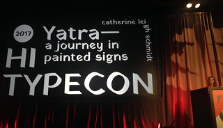
Other Posts about TypeCon

Here are some other posts about TypeCon 2015:

Photos:

Videos:

Presentations:

  • The Bee in the Lotus Flower, John Hudson [slide deck PDF].
  • Using Type to Add Data to Data Visualizations, Richard Brath [blog post with link to PDF].

Posts about ATypI 2015

Please let me know if any corrections are needed. I look forward to seeing folk at future type gatherings. If I can find space in the peninsula/south bay of the bay area, California (and people would be interested), I may try to organize type get-togethers. Probably near Mountain View, CA.

Jeff Kellem (@composerjk / @slantedhall)

Posted in 1403 vintage mono pro, atypi, conference, presentation, tripreport, typecon, typecon2015 | Tagged , , , | Leave a comment

TypeCon 2014 Conference Trip Report

27 Jun 2015 Update: Registration is now open for TypeCon 2015: Condensed, 12–16 August 2015 in Denver, Colorado, USA. Save $50 by first becoming a member of SOTA. Check out the great workshops and a preview of the program! Hope to see you there!

Update: TypeCon 2015: Condensed will be held 12–16 August 2015 in Denver, Colorado, USA. Videos from 2014 are added as SOTA releases them and linked throughout this post and in the Links section.

It’s that time of year: another type design conference. TypeCon (@typecon / @typesociety) was held in Washington, D.C., 28 July 2014 through 4 August 2014. Though a number of friends (and regular attendees) were not in attendance this year, it still managed to be a great conference. Lots of great folk, past attendees and ones at their first TypeCon.

Jump to: WednesdayThursdayFridaySaturdaySundayType Crit,
Fiona Ross SOTA AwardIndependent Type Designer Business Workshop,
KeynoteEducation ForumLinks (write-ups, presentations, photos)Feedback.

I arrived on Tuesday afternoon into DCA, took the Metro to the hotel. It’s been over 20 years since my last visit to D.C. Nice to have a good metro, again. A large group of us walked along H Street to find dinner, for a long while. The place we attempted to eat had a 1.5 hour wait. So, a few split off to head to the south asian place that smelled good. I joined them at Cusbah (Yelp). Indeed, it was quite tasty. Another group of four showed up a little while later.

Wednesday: I’d signed up for the Devanagari: Simplifying the Complex workshop by Rob Keller (@rnkeller) & Kimya Gandhi (@KimyaGandhi), partially due to input from Erin McLaughlin (@HindiRinny). Unfortunately, the buses left very late from the hotel to head to the Corcoran College of Art + Design—I heard that at least one went to the wrong location, first—so, the workshop started 45 minutes late. The best part was the 44-page booklet they put together for us as an overview and reference to Devanagari. Though OpenType & Unicode are finally being used more, there are still lots of proprietary font formats and encoding in use. Though we practiced handwriting and reviewed features useful for Indic scripts in Glyphs (@glyphsapp), we did not get to working on any exercises designing/digitizing Devanagari glyphs with Glyphs. They probably needed another hour or two to cover everything they wanted. I had hoped to do some work designing digitally in the class. Still, a useful class, especially due to the booklet. A good group of folk in the class, including Eben Sorkin (@ebensorkin), Lisa Maione (@lisamaione), Lila Symons (@daycalligraphy), Amit Patel (@apatel314), James Puckett (@Dunwich_Type), Chris Lozos (@dezcom), and others.

The Glyphs.app for the Pros class had a good group in it. It sounded like some good discussions occurred, though I was not in the class to hear. This workshop was aimed for those coming from another type design software program, such as FontLab. I’d been using Glyphs for the past couple years, but I always like to hear about other folks’ workflow and how they’ve chosen to use Glyphs. Now, to get back to some of those type design workflow tools projects.

Wednesday night: Dana Tanamachi talked about her path to chalk lettering and design. She graduated from the University of North Texas (@UNTnews), Denton, TX. Also created the posters for Roundabout Theatre’s (@RTC_NYC) production of Bye Bye Birdie. (As an aside, Roundabout’s archivist Tiffany Nixon was helpful in getting a photo of Bill Irwin & Mary Bond Davis from Scapin for the 2012 tribute presentation & 6-piece dance performance I put together for Stanford University dance historian Richard Powers at the New York Baroque Dance Company’s Santa Barbara Historical Dance Workshop [Tribute videos]; Richard was choreographer and dance historian for Bill Irwin’s Scapin.)

Thursday: The first workshop I signed up for when registering was Between the Letters: The Business of Being an Independent Type Designer. It filled up very quickly. Luckily, they found space at the hotel (bonus: we didn’t have to take the long bus ride!) and added another 15 slots. So, we had 30 independent type designers in the room. The panel was run by Silas Dilworth (@silasdilworth), Matthew Butterick (@mbutterick), & Jackson Cavanaugh (@okaytype). Attendees included a great mix of type folk, from a few wanting to get started to those who’ve been doing this for 50 years. A great workshop! I’ll hopefully transcribe some of my notes in another post and will link to it here.

I also really wanted to take Liron Lavi Turkenich‘s (@LironLaviTur) workshop on Hebrew Type Design: Tasting of a Square Script, but the Independent Type Designer Business workshop was more important for me, right now, even though I have Hebrew designs completed and in-progress. She gave a talk at TDC (@TypeDirectors) in New York City right after TypeCon on her Aravrit project, ambitiously blending Hebrew & Arabic.

Education Forum

Here are a few mentions of the talks in the Education Forum. It looked like a good program this year. If I hadn’t been in the Business workshop, I’d have attended.

The superb Aoife Mooney (@aoifemooney) of Kent State University, Ohio talked about The Design Process Made Manifest: Teaching to Learn, Learning to Teach. Gerry Leonidas (@typefacedesignagrees. Heard her talk went quite well. Later, I made sure to introduce Max Phillips (@signaltype) and Aoife; Max is currently in Dublin while Aoife is from there.

Martina Flor‘s (@martinaflor) Golden Secrets of Lettering: Look, Explore, Sketch Fast, Practice.

Martina’s student’s answers to “What is the work of a type designer like?”

They take days to draw a single letter. Work on the same project for years. It’s a lonely job. Don’t have to deal with clients. Take pills to stay up.

She also has Wallpapers for Type Nerds available.

Sumner Stone (@sthoths) on Teaching Letterform: Modularity & Refinement.

Thursday night started with the keynote by Tobias Frere-Jones (@tobias_fj). Some were wondering what he might talk about. He presented exactly what I’d hoped: some of the fabulous historical research he’d been doing recently on the typography of bank notes and counterfeit reduction techniques using type that he’d uncovered. Great stuff. He does the kind of research that I like to do. I hope that Tobias publishes a book of the material he’s found. It would make a good one. A fun slide from his talk with a quote from U.S. President Barack Obama on U.S. Treasury Secretary Jacob Lew’s illegible signature (looks like a series of loops).

I had never noticed Jack’s signature, and when this has highlighted in the press, I considered rescinding my offer to appoint him. Jack assures me that he is going to work to make at least one letter legible, in order not to debase our currency, should he be confirmed as secretary of the Treasury.

Check out some of the banknote images on his blog plus a couple lottery tickets from France (1936) & Latvia (1965).

As a related aside…For the first time, I finally walked into The Jehning Family Lock Museum of Mountain View. My dad did pioneering work in security that included working with locks and was also in the Navy. Al Jehning was in the Navy in WWII. It was great to talk with Audrey & Al. Other unexpected connections appeared. Daniel T. Ames (who built the building in 1903) was also a handwriting and forgery expert in addition to being a prolific calligrapher and teacher during the mid to late 1800s. They had a copy of his book Ames on Forgery: Its Detection & Illustration (1900) and samples of his pen work. Reminded me of Tobias’ TypeCon keynote on banknotes; I’ll pass along contact info and such. Other books he authored include Ames’ Alphabets, adapted to the use of Architects, Engravers, Engineers, Artists, Sign Painters, Draughtsmen (1884), Ames’ Guide to Self-Instruction in Practical and Artistic Penmanship (1884), The Daniel T. Ames Notebook (1860s), and Ames’ Compendium of Practical and Artistic Penmanship. He was also the founder and editor for 20 years of The Penman’s Art Journal of New York (link for Volume 1, 1877).

Indra Kupferschmid (@kupfers) & Jacob Heftmann (@jheftmann) put together a web page about Tobias’s early typefaces at FontBureau (@fontbureau). Totally worth reading.

Conference talks

The main conference program started Friday morning with Rob Saunders (@lettarc) of the fabulous Letterform Archive showed 20th Century Metal Type Foundry Ephemera with great, fun type specimens from 1900 to the 1960s. If you’re in the San Francisco, California area, you should make an appointment to visit extensive collection at the Letterform Archive. During Rob’s talk, I recognized some of the pieces I viewed, such as the Hebrew one here, during my last visit. He also had an exhibit of the specimens on display throughout the conference. 

TypeCon 2014: Rob Saunders on 20th Century Metal Type Foundry Ephemera

John Collins of MyFonts (@MyFonts) talked about the business of MyFonts and how it’s helped type designers to make a living. From his “Some Amazing Successes” slide:

  • Dozens of independent font designers have been able to quit their day jobs and focus on type design.
  • 6–8 out of 10 of the MyFonts Top 50 fonts are typically from independent designers.
  • Not unusual for #10 on the MyFonts Top 50 to sell $20K per month.

Marcin Wichary (@mwichary) & Dustin Senos (@dustin) talked about Crafting Type at Medium. Talking about the work they did seemed to get a number of type folk more interested in Medium. Good job. There was mention of the previous work on Crafting Link Underlines on MediumAlas, I missed introducing myself to Marcin and thanking him; I used a photo of his (under a CC BY 2.0 license) to introduce my TypeCon 2013 talk Resurrecting Type of the IBM 1403. 

Mitch Goldstein (@mgoldst) showed his experiments with typography and photography/videography, creating new images, in Typo + Photo. Reminded of experiments with cameras many of us did in the past, exploring the media.

Nancy Sharon Collins (@thengravinglady) shared the history & examples of calling cards from the Victorian era through the 1950s in Codes and Cards: Symbology from Victorian-Era Calling Cards. It’s great to see the etiquette of the past. My dance troupe Academy of Danse Libre (@danselibre) recreates and performs social dances as they were danced from the Victorian era through the 1930s, bringing to life that period of history, including mannerisms and attire. I thought I took some notes, but haven’t located them, yet.

Mark Simonson (@marksimonson) showed his fun history with offset press in The Romance of Offset [video]. Lots of fun experiments and images.

Hrant Papzian (@hhpapazian) talked about libre type design and helping improve typography support for minority cultures in Liberation from Mediocrity, or, The Freedom of Paying Bills [video]

Friday evening: Krista Radoeva (@kristaradoeva) received the 2014 SOTA Catalyst Award. Well deserved. She’s been doing some fabulous work.

Saturday

In David + the Machine, Aaron Bell (@aaronbell) gave an interesting talk on how an Intertype machine had been modified by Rev. Dae-Wii (David) Lee in the early 1900s to fit Hangeul onto the 90-key keyboard, allowing Korean typesetting.

Mila Waldeck showed The Typography of George Maciunas (leader in the Fluxus group). Some of the music groups that Fluxus worked with include John Cage, Velvet Underground, John Lennon, among many others. Always nice to see the crossover into my music world. Their exploration with experimental music makes me think of the fabulous contemporary art music, mostly improvised, house concerts at my friend Tom’s Place in Berkeley, California.

Mark Jamra showed work of his class on creating wood type with a CNC router in Word Type Teamwork: From Analog to Digital and Back Again, talking about the Philasoro project, so named for sisterly love, as the ladies in this class were doing all the work with the project in Philadelphia, the city of brotherly love. And, the guys in the class had dropped out. 12-line 4A wood type.

Thierry Blancpain (@blancpain), co-founder of Grilli Type, described the current state of Swiss design in Young Swiss Style: Contemporary Swiss Graphic Design, showing samples of the variety of work coming from good, young designers in Switzerland.

Sample of Grilli Type Foundry’s (@grillitype) work.

David Lemon (@typenerd1) showed the process of the past Three Decades of “Getting Better” in type design at Adobe from the first PostScript fonts until today. The tweet photo is the first version of Courier, stroke + offset. It’s also worth reading The Adobe Originals Silver Anniversary Story, a nice overview of some of the history of type at Adobe (@adobetype).

Nick Shinn showed The Look of Sound: Branding and Marketing of New Technology in the American Record Industry, 1888-1967. Though I saw a related talk of his at TYPO SF 2013, there was new material and other interesting work in here. Always fun to see. Plus, given my photography work with bands (albums, tour posters, etc.), my own music work, and love of history, I have a strong affinity to this type of presentation. Folk I know in The Recording Academy (@grammypro) and TapeOp (@tapeopmag) communities would have enjoyed this presentation, also.

TypeCon 2014: Nick Shinn on The Look of Sound

Liron Lavi Turkenich (@LironLaviTur) talked about a great oddity in the history of Hebrew type design—the Schoenfieldian script in Radical Anecdotes in Search for Solutions.

TypeCon 2014: Scott Boms on Type at Scale: An Inside Look at Typography at Facebook

Scott Boms (@scottboms) talked about Type at Scale: An Inside Look at Typography at Facebook [video] and how they find ways to integrate typography throughout the Facebook campus.

What is everybody doing here?

He talked about the Analog Research Lab printing studio and workshop at Facebook. Here’s an inside look photo spread from 2010–2013 by Ben Barry (@benbarry).

Scott Boms also mentioned the customized version of Process Type Foundry’s (@processtypeKlavika (designed by Eric Olson @xeolsonx), customized by Neil Summerour (@positype) with help from Erin McLaughlin (@HindiRinny) for the Arabic wordmark.

Carl Crossgrove (@CarlCrossgrove) showed a history of The Sans with Contrast: Seriflessness Across Time. Fun examples of sans-serif designs with contrast. As Theresa Dela Cruz (@theresadelacruzwrote, “The Serifless Romans in Carl Crossgrove’s talk are really lovely.” Agreed.

Matthew Carter gave a lovely tribute to Hans Eduard Meier, who passed away on 15 July 2014.

TypeCon 2014: Tribute to Hans Eduard Meier by Matthew Carter

TypeCon 2014: Tribute to Hans Eduard Meier by Matthew Carter

There’s a nice 2012 piece on Hans Eduard Meier, a life dedicated to letter design by Roxane Jubert at Typotheque (@typotheque) in English, Français, & Español with added illustrations; totally worth reading. My copy of his Die Schriftentwicklung arrived while at TypeCon, along with the updated edition of Size-specific adjustments to type designs by Tim Ahrens & Shoko Mugikura (@timandshoko)!

Here are some tributes for Hans Eduard Meier from:

Nadine Chahine (@arabictype) showed her design process and work on Zapfino Arabic: A Question of Slanted Writing and working with Hermann Zapf. She had some nice quotes in praise of the type design program in which I do most of my current type design, Glyphs (@glyphsapp).

Glyphs improved my quality of life. How many use Glyphs? How many who design typefaces use something else? All of you should switch!—Nadine Chahine

SOTA Typography Award

It was great to see Fiona Ross one night. We’d met at a previous conference; I always enjoy talking with her. At the time, I didn’t know she’d be receiving the 2014 SOTA Typography Award. Well-deserved! A great choice. In addition to all the non-Latin work Fiona’s accomplished, she also pioneered phonetic keyboard input. John Hudson presented the award to Fiona. [Presentation video.] A quote from Fiona that Thomas Phinney captured:

300M Bengali speakers, but they still send text msgs in Latin because no good Bengali font exists on cell phones.—Fiona Ross

Let’s get to work, then!

Here are some other write-ups about Fiona receiving the award, from:

This year, the Type Quiz was extra fun since Nick Sherman (@NickSherman) & Stephen Coles (@stewf / @typographica) were leading! Awesome fun! Martina Flors and I scored around the middle area. I even missed some things I remember reading about in the past week or two. D’oh. There was a fun three-way tie at the end for top score. It took a while to break that tie. And, here was a fun question; I believe the answer was covered in the original question slide. Typefaces for National Geographic (@NatGeo). Here’s a nice Smithsonian (@SmithsonianMag) post on The Secret to National Geographic’s Maps Is an 80-Year-Old Font, showing this image.

TypeCon 2014: Type Quiz!

Sunday morning started with David Jonathan Ross (@djrrb) of FontBureau (@fontbureau) talking about Cracking the Code and his work on looking at typefaces used for coding, considering proportional, differing widths and styles, and other typography. He included a history of monospace typefaces. This presentation also showed his design for and introduced his latest typeface Input. It was quickly used in Nicholas Felton’s (@feltronFeltron Annual Report (FontBureau blog post). 

It was quite nice of David to call out my talk on Resurrecting Type of the IBM 1403 mainframe line printer from TypeCon 2013, showing a specimen of my resultant 1403 Vintage Mono Pro typeface. Thanks, David!
TypeCon 2014: David Jonathan Ross on Cracking the Code

John Hudson of Tiro Typeworks (@TiroTypeworks) talked about the Problems of Adjacency [annotated slides PDF with new ideas in the afterword from Q&A with Nadine Chahine (@arabictype)]. John always provides great information and insight with the technical detail, knowledge, and history he presents.

Here’s some info about DecoType’s Advanced Composition Engine (ACE), formerly known at the Arabic Calligraphic Engine. The manual for the Tasmeem fonts [PDF] and this video on Tasmeem describe some of ACE. Thomas Milo (@ThomasMiloNL) talked about it at the Stanford University Library (@StanfordLibs), 7 February 2014, in Raising the Stakes in Arabic Text Handling. Ramzi Salta (@ramzisalti) wrote a nice post about the talk. Nice to catch up with Thomas there.

Kimberly Elam showed the work of Josef Müller-Brockmann, like this Beethoven concert poster.
TypeCon 2014: Kimberly Elam on work of Josef Müller-Brockmann

The Type Crit is one of my favorite parts of TypeCon. A type designer gets 10 minutes of quick critique with three master type designers: Akira Kobayashi, John Downer, & Matthew Carter. You can learn a lot by listening and watching the proceedings. Here’s one shot of James Todd’s (@JamesToddDesign) critique with James and Akira smiling.

TypeCon 2014: Type Crit

https://twitter.com/jetpack/status/371751623837495297

I also got permission to use a nice quote from Matthew Carter during last year’s Type Crit with me regarding my 1403 Vintage Mono Pro typeface.

 I may steal that…you may see that again.—Matthew Carter

This year, I donated a copy of Michael Harvey’s Creative Lettering Today book to the Silent Auction; I believe that Shelley Gruendler (@dr_shelley) managed to get that one. I also donated a couple copies of Microsoft’s Mathematical Typesetting booklet. There was a great Mathematical Typesetting book that John Hudson had donated (along with the Microsoft booklet)—it might have been The Printing of Mathematics, Oxford Press; I let JR Osborn (@jrosborn) get that book, since he’d have a more immediate use for it. I did manage to pick up a few items:

Hrant Papazian‘s (@hhpapazian) photo of the Webtype (@Webtype) demo table for David Jonathan Ross’s (@djrrb) new Input typeface, showing “three eras of monospaced fonts.” Hrant and I talked about Armenian type design and other things. It would be fun to someday include Armenian designs in my typefaces. Good to finally meet.

Some random discussions occurred during meals and in the hallways. Max Phillips (@SignalType) and I discussed type design workflow patterns, tools, and Glyphs at the West Wing Cafe, across the way. The cafe was good for breakfast, each day, with an English muffin egg over hard sandwich. Yum. Dinner with James Todd (@JamesToddDesign), Taylor Bryn Hultquist (@Taylor_Bryn), Paul Hunt (@pauldhunt), & Mark Simonson (@marksimonson). At the bar with Gerry Leonidas (@gerryleonidas / @typefacedesign), Liron Lavi Turkenich (@LironLaviTur), Rob McKaughan (@robmck), and others. I wanted to talk more with Jimmy from FontLab; met him with Emily Connors (@emilylimedesign). I met Frank Martinez (interview), briefly, but didn’t run into him again for chat, alas; it would be interesting to talk about font licenses in today’s world. Some nice conversations with Monika Bartels (@MoniBPython) & Sonja Keller (@sonja_keller); Sonja’s also doing font production work with TypeTogether (@typetogether). And, it’s great to have James T. Edmondson (@jamestedmondson) back in the bay area. Jan Middendorp (@JanMiddendorp) and I talked about music and how his nicely designed Shaping Text: Type, Typography, and the Reader book would make a great introductory typography course. The music side related to my return to music notation type design.

I also had the chance to chat with Irina Petrova & Alexandra Korolkova of ParaType about my possible trips to Russia (and my past) for dance and type. They mentioned the Serebro Nabora conference at the end of November 2014. I already had that on my list to consider attending, especially since I canceled a Europe & Russia dance & type trip this summer. Though, I just found out that a wedding may cause me to miss the conference this year. Other type folk I know will be speaking, including John Hudson (@TiroTypeworks) and David Jonathan Ross (@djrrb). Would be fun to connect with other type designers in Russia. 


TypeCon 2014: Smithsonian Museum of Natural History Ocean Hall

TypeCon 2014: Smithsonian Museum of Natural History Ocean Hall

On Sunday afternoon, I finally took a walk along The National Mall, popped into the Smithsonian National Museum of Natural History (@NMNH), and checked out the Sant Ocean Hall (@OceanPortal) exhibit. Taylor Hultquist (@Taylor_Bryn), an illustrator with a love of ocean stuff, recommended checking out the Coelacanth in the exhibit. Alas, The National Fossil Hall was closed for renovation (photos + time-lapse). The future exhibit looks to have some fun potential. Rainer (Eric) Scheichelbauer (@mekkablue) and I caught up with each other and walked around the National Gallery of Art’s Sculpture Garden (@ngadc). My phone battery had died, so there are no photos of the Sculpture Garden. We also ran into Rob Keller (@rnkeller) & Kimya Gandhi (@KimyaGandhi) on the way back to the hotel. If I hadn’t told folk that I’d join them before the evening events, we would have gone with Rob & Kimya to a café.

TypeCon 2014: David Sudweeks, always stylish. Seahorse socks!

I carpooled with Theresa Dela Cruz (@theresadelacruz) and David Sudweeks (@nondescriptes) to the Sunday evening party. David was preparing video for the revival of the FontCast video series. Check out the first one (#18) with John Hudson (@TiroTypeworks)! The music was composed by Theresa, too. More musician + type folk! David is always fashionable. Check out his seahorse socks. He might have picked them up at the Sock Shop on Telegraph, Berkeley, California. The party was at Lucky Strike Bowling. A good job with continuous food, bowling (and attempts thereof), some random fun fusion dancing (a mix of tango, salsa, blues, etc.) with fellow dancer Andrea Leksen (@leksendesign) in between frames, plus some nice conversations and a bit of salsa dancing. There was also a salsa dance & class happening in Lucky Strike. Later, I found that some friends had managed to grab one of the three pool tables. So, I joined them for some pairs 8-ball. Ages ago, I used to play billiards regularly. Alas, the local pool halls with all the pros coming in closed.

After the party was over, a bunch of us ended up across the street at the Rocket Bar (@rocketbardc). Turns out they had a bunch of pool tables, also. Plus shuffleboard and skee ball. Fun to pull up some nostalgia by playing skee ball with Erin Ellis (@rrrellis) and make some attempts at shuffleboard. With the conference over, JP Porter finally gets to relax, too. She does a fabulous job of running the show smoothly, each year, for us!

TypeCon 2014: After Party with bowling and a little billiards.

Feedback for conference

The Independent Type Designer Business workshop could’ve been a full day for more in-depth discussions. We should also try to have related talks more incorporated into the conference program. The workshop would still likely be useful even with that integration, I think, for some smaller face-to-face introductions and discussions.

How to make Education Forum better attended? I always want to attend, but sometimes have conflicts. This year, it sounded like talks were better than last year. Good job! There was mention of a discount for conference attendees to encourage more participation, but I don’t recall seeing it. Consider making that more obvious. Also, the Education Forum link should perhaps be a first class citizen.

Other Posts about TypeCon

Here are some other posts about TypeCon 2014:

Presentations / Slide decks:
Photos:

Please let me know if any corrections are needed. I look forward to seeing folk at future type gatherings. If I can find space in the peninsula/south bay of the bay area, California (and people would be interested), I may try to organize type get-togethers. Probably near Mountain View, CA.

—Jeff Kellem (@composerjk / @slantedhall)

Posted in 1403 vintage mono pro, atypi, conference, presentation, tripreport, typecon, typecon2014 | Tagged , , , , , | Leave a comment

Survey: Opinions on Music Notation & Scores

One of my next projects will be designing quality music symbol fonts. Getting back to my roots, so to speak. My first foray into type design 20+ years ago was working on music notation software research and development projects.

The resultant fonts will be for use within music notation programs, such as Noteability ProSibelius (@AvidSibelius), Finale (@finaleofficial), LilyPond (@GNU_LilyPond & @LilyPondBlog), MusiXTeX, MuseScore (@MuseScore), and Steinberg’s (@steinbergmediaDorico by former Sibelius engineers (@dspreadbury has been writing the scoring application’s progress notes in the Steinberg blog Making Notes). The Steinberg folk have been working on SMuFL (Standard Music Font Layout) which I also plan to support.

I’m interested in hearing opinions on various aspects of scores you’ve used. What you liked, what caused issues during rehearsal, etc. If you’d prefer, you can send your opinions via email: music-survey@slantedhall.com

Here’s the direct link to the embedded survey below.

Jeff Kellem (@composerjk / @slantedhall)

Posted in music notation, typeface, typography | Tagged , , | 1 Comment

1403 Vintage Mono font used in book cover design for Grantland’s sports analytics compilation book

[tweet https://twitter.com/composerjk/status/435685179454013440 width=”150″ align=”right”]

While preparing to teach and work with some fabulous 6-12 grade movement teachers about social partner dancing at the 2014 Movement Education Week (@HealthyMovement), I heard an update from one of our typeface customers.

Our 1403 Vintage Mono typeface was used in the book cover design for Grantland‘s new sports analytics book Talk Nerdy to Me: Grantland’s Guide to the Advanced Analytics Revolution. Jason Oberg (@ExtraBlasedesigned the cover. Nice work, Jason! This paperback compilation was published by ESPN (@ESPN) and Grantland (@Grantland33) in conjunction with the MIT Sloan Sports Analytics Conference (@sloansportsconf & #SSAC14), 28 February 2014 to 1 March 2014. The book is part of the conference attendee gift bag.

I wish I were attending the conference to receive a copy of the book for both the content and to see the printed copy using my 1403 Vintage Mono font. I did a bit of work in analytics and visualization in the past. It’s been added to the font in use examples of 1403 Vintage Mono.

Talk Nerdy to Me: Grantland's Guide to the Advanced Analytics Revolution. Book cover design & photo by Jason Oberg.

Photo credit: Jason Oberg (who also designed the book cover).

Bill Simmons (@BillSimmons) posted the front/back cover photo (listing contributors) on Facebook that’s used on Grantland’s Facebook page.

[tweet https://twitter.com/composerjk/status/435825422677180419 width=”150″ align=”right”]

If the list of contributors on the back cover is complete, it looks like the compilation did not include Bess Kalb‘s (@bessbell) Grantland article on John Burgeson, The Lost Founder of Baseball Video Games: A tale of obsession, punch cards, and a ’60s computer the size of a hatchback. Given the use of my IBM 1403 inspired typeface on the cover, it would’ve been fitting to include the article (even if not directly related to the analytics revolution).

Links about the book & font:

Jeff Kellem (@composerjk / @slantedhall)

Posted in 1403 vintage mono pro, book design, fonts in use, typecon2013, typeface, typography | Tagged , , , , , , , , | Leave a comment