TypeCon (@typecon / @typesociety) was held in Denver, Colorado, USA, 12–16 August 2015. Though attendance seemed lighter this year, it was another great conference. Lots of good folk, past attendees, and ones at their first TypeCon.
In between TypeCon and finishing up this trip report, the following have happened:
- ATypI 2015 in São Paulo, Brazil, 14–17 October 2015.
- Links for posts & photos at the end of this trip report.
- Call for Programming (deadline: 29 February 2016) for TypeCon2016:Resound in Seattle, Washington, USA, 24–28 August 2016.
- Call for Presentations (deadline: 31 March 2016) for ATypI 2016 (@ATypI) in Warsaw, Poland, 13–17 September 2016.
Jump to: Wednesday, Thursday, Friday, Saturday, Sunday, Type Crit,
Robert Slimbach SOTA Award, Shiva Nallaperumal SOTA Catalyst Award,
Keynote, Links (write-ups, presentations, photos), Feedback.
Tuesday, 11 August 2015
After checking into the hotel, I walked a couple miles to catch the latter portion of Kyle Read’s (@kyleread) launch party for his new Badson Studio (@BadsonStudio). Glad to be able to make it there before the end to help him celebrate. Kyle also designed the Local Survival Guide. It was one of the best designs I’ve seen of the local guides for TypeCon. Great job, Kyle!
I started the conference off with Rainer Erich Scheichelbauer’s (@mekkablue, @schriftlabor) workshop on Color Fonts with Glyphs. It was fun to see more folk moving to, or considering, Glyphs (@glyphsapp) for their type design work. It’s what I use every day.
Nicholas Felton (@feltron) designed the brand for the 2015 conference. Alas, I had to skip the Type Directors Club (@typedirectors) sponsored event with Nicholas speaking. I had a last minute request to teach an impromptu Mazurka Tango class at the American Vernacular Dance Wednesday Waltz Etcetera at The Avalon Ballroom in Boulder, Colorado. Last minute, meaning I was picked up five minutes after agreeing to teach and teaching the class 20 minutes after arrival in Boulder. Here’s a demonstration video of the Mazurka Tango (aka Mazurka Clandestine) showing some of the style of dance I taught that evening.
Later that night, there were some good conversations with Scott Boms (@scottboms), Luke Dorny (@luxuryluke), and James Todd (@JTDType), until late. I should’ve gone to bed earlier, but it was difficult to leave fun conversation with good folk.
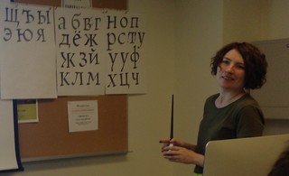
The was a good group of folk in Alexandra Korolkova’s Cyrillic for Real Use workshop, including Chris Lozos (@dezcom), Thomas Phinney (@thomasphinney), Anna Konyuhova, Neil Patel (@neilspatel), and others. Great tips and history about the Cyrillic script. In addition to the useful cheatsheet booklet she gave us, she showed details from previous presentations. A sample of what’s in the booklet can be see in this livejournal post. While practicing drawing Cyrillic, I had my first experience with a pointed pen and learned a little how to use one as a left-hander. Anna wrote about her experience and practice after the conference.
I heard great things about John Downer’s 2-day workshop on Sign Painters’ Single-Stroke Majuscules and Stephen Rapp’s Expressive Brush Lettering workshop. Some nice photos from both workshops are near the top of Helen Lysen’s TypeCon 2015 photos. I also wish I could have attended Education Forum, but the Cyrillic workshop was not to be missed.
Marian Bantjes’ (@bantjes) keynote was an enjoyable look at her past work and the paths she took. I thought about asking her to talk about her fabulous work on the Tales of the Brothers Grimm book with drawings by Natalie Frank (@nataliepainter4), but figured if she hadn’t mentioned it, there might have been a reason she wasn’t including it. Turns out, it would’ve been fine. Next time, I’ll ask.
The AIGA-sponsored (@aigacolorado) after party was at a large bar with pool tables. I didn’t play pool, though it had come up in conversation the night before.
Conference Talks
Mary Mashburn, of Maryland Institute College of Art [MICA] (@mica_news) and Typecast Press, showed some of the great history of iconic jazz and R&B posters in Life Lessons from Globe Poster, including lovely posters from their collection of B.B.King, Marvin Gaye, Aretha Franklin, and many others. MICA now keeps Globe alive and in production. Some folk I know went to MICA including Erin Ellis (@rrrellis) and Shiva Nallaperumal (@shiva__n). Some of the posters were given as prizes at the Type Quiz.
In Wrong reading: Examples of Double-Sided Wood Type, Jason Wedekind (@genghiskern) provided an overview of pieces collected and the history of some of the double-sided wood type he’d found and researched. Some of the #typetwofers images are on Instagram.
Frank Grießhammer (@kioskfonts) talked about the vector fonts that Dr. A.V. Hershey designed (while at the U.S. Naval Weapons Laboratory in the late 1960s) in The Hershey Fonts [video]. Welcome to my world, Frank. A fun exploration into some of the history and his path to resurrect the Hershey fonts using the original data points combined with modern OpenType font technology. Hershey wrote the technical report Calligraphy for Computers in 1967. Thanks for the shout-out, too.
My first experience with the Hershey fonts was in the X Window System back in the mid-to-late 1980s. I knew or worked with a number of the X Window System developers. I also had re-visited the fonts in the past couple years, thinking I’d convert them to modern outlines. That project can now be crossed off. Frank plans to put his results on Adobe Type’s github. May help, if that makes sense.
In 2011, my friend Windell Oskay (@oskay) of Evil Mad Scientist Laboratories (@emsl) wrote the Hershey Text: An Inkscape extension for engraving fonts (for laser cutters, CNC routers, 3D printers, pen plotters, etc., along with their EggBot). The Hershey Text extension is included in Inkscape version 0.91, as of January 2015.
Joe Galbreath talked about the history and show samples of The Commercial Monograms from the GramLee Collection [at West Virginia University (@wvucca)]. There were some great wood type examples in this presentation.
Scott Boms (@scottboms) moderated a nice panel on Filmotype Junto: The First Font Cooperative by Stuart Sandler of Font Diner (@fontdiner) & Font Bros. (@fontbros). Other panel participants included Lily Feinberg (@lilyfeinberg), Patrick Griffin, Mark Simonson (@marksimonson), and Neil Summerour (@positype). It would be fun to participate in some of those Filmotype revivals.
Steve Ross (@steveross1956) & Miguel Sousa (@forcebold) talked about A New Approach to Type Design at Adobe [video] The program Adobe Type Concepts was introduced in early 2015 with a new typeface release by Miguel called Vortice.
Rainer Erich Scheichelbauer (@mekkablue) presented fun experiments with OpenType in Yes, But Can OpenType Do This? The entire presentation had no slides but live typing showing games, animation, and more using OpenType features in fonts. The examples came from Eric’s and his classes’ experiments. Nicholas Felton (@feltron) captured a version of the nim game from the 1961 film L’année dernière à Marienbad implemented by Erich (@mekkablue) in a font’s OpenType features.
https://twitter.com/feltron/status/632297627283910656Andrej Krátky (@AndrejKratky) talked about The History and Future of Font Licensing and introduced the Fontstand (@fontstand) service.
Dave Addey’s (@daveaddey) talk Typeset in the Future was a fun exploration of type used in sci-fi films and how it affects the characters in the film. He included great detail from the film Alien (totally worth reading) and how English and French versions for the self-destruct procedure were different. It seems that the French translation left out a couple important steps. Hmm…
The 2015 SOTA Catalyst Award was presented to Shiva Nallaperumal (@shiva__n). Check out some of his fabulous design work.
Paul Herrera talked about The Life and Times of Father E.M. Catich. An interesting look into Edward M. Catich’s life. I thought it was a little over the top to throw the Adobe Silver Anniversary book to the ground since it didn’t reference Catich’s contribution to those forms. Still, it was good to hear about his life.
Paul D. Hunt (@pauldhunt) went through An Illustrated History of Non-Latin Typeface Development at Adobe. It was interesting to see what’s gone on and what’s happening for the future. I would have liked to hear more about the process.
John Hudson (@tirotypeworks) talked about the MCLI (Murty Classical Library of India) (@MurtyLibrary) publication and fonts John & Fiona Ross designed for it in The Bee in the Lotus Flower [slide deck PDF] John invited four folk to read translated poetry while the original Indian text was displayed on the screen. The readers included: Jeff Kellem (me, @composerjk), Marian Bantjes (@bantjes), Kent Lew, and Diane Collier. Nice comments from folk on the reading. Always great research and details in John’s talks.
Radek Sidun (@RadekSidun) covered type design in the Czech Republic in Briefcase Type (@BriefcaseType) Foundry: Milestones in Czech Type Design. I wish I’d made time to visit type folk when I was in Prague and Plzeň last summer for the Dvorana Vintage Dance Week 2015. It was nice to see some of the Czech type design history.
Alas, I missed Nikki Villagomez’s (@nikki_vz) talk How Culture Affects Typography and some others due to conversations.
Joseph Alessio (@alessio_joseph) showed a nice sample of old and new stencil forms across a wide array of writing systems around the world in Stencil Type: Fusing Form and Function [video]. There was a fun sample by Regan Fred Johnson (@reganjohnson).
Rob Saunders (@Lett_Arc) gave an interesting, as always, dive into the work of Ernst Schneidler & his Students, including some possibly familiar books, such as The Very Hungry Caterpillar, by Eric Carle (@ericcarle), student of Ernst Schneidler, published by Rob. Samples can be viewed at the wonderful Letterform Archive (@Lett_Arc) in San Francisco, California, USA. Worth a visit or several.
The SOTA Typography Award was presented to Robert Slimbach. Christopher Slye (@ChristopherSlye) accepted the award on Robert’s behalf. The 21 minute video presentation can be seen on the SOTA Typography Award page or on Vimeo.
The Infamous Type Quiz is often fun, especially with Nick Sherman (@NickSherman) and Stephen Coles (@typographica) as masters of ceremonies. I managed to scored 33. I don’t recall the max. Check out the great photos of the quiz by Helen Lysen (@hcdarling). James Edmondson’s (@ohnotypeco) fun Hobeaux typeface was used in the Type Quiz slides.
I missed the Sunday morning talks due to participating in the Diversity committee meeting, led by Erin McLaughlin (@hindirinny). It was a good brainstorming session with 28 folk. Discussions continued after the conference. A report of suggestions to consider was sent to the SOTA Board (@typesociety, @typecon) on 12 October 2015.
While we were having productive discussions… Meta Newhouse (@metanew) talked about her Type of Place project. Max Phillips (@SignalType) talked about Letters & Crime on Hard Case Crime (@HardCaseCrime), publishing yesterday’s and today’s crime fiction. And, Doug Wilson (@realdougwilson) talked about The Beautiful Island of San Seriffe.
Dan Rhatigan (@ultrasparky) delved into the rub-down type and history in Learning (and Unlearning) from Letraset. When he displayed a foreign languages sheet, someone in the audience said they might have one. Both Dan and I exclaimed “oooo!” or had that breathe of excitement. That sheet would be fun to see.
Nick Shinn (@ShinnTypeInc) covered history and his own explorations into OpenType features in Adventures in Contextuality.
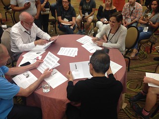
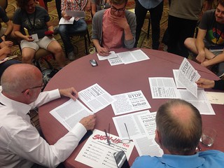
One of my favorite aspects of TypeCon is the Type Crit. A type designer gets 10 minutes of quick critique with three master type designers: Akira Kobayashi, John Downer, & Roger Black (@RogerBlack). The brave type designers who showed samples of their in-progress work included:
- Andrea Leksen (@leksendesign).
- Joshua Farmer (@jfjudah).
- Laura Rossi Garcia (@laurarossig) showed her Irene typeface. Beautiful work. The Vermont College of Fine Arts (@vcfa) had a post about her process.
- Mattox Shuler (@MattoxShuler, @fortfoundry)
- Kenneth Ormandy (@kennethormandy) showed his Implicate typeface. It works surprisingly well at small sizes.
- Harry S.
The closing night party was in the parking lot of Our Mutual Friend Brewing Company (@OMFbrewing). Luckily, the Taj Palace and Mobile Meltz (@mobilemeltz) food trucks had non-alcoholic drinks, as OMF Beer did not (other than water). Rick Griffith (@rickgriffith) of MATTER (@matter) was the DJ for music in the lot. I ended up dancing a little with a few partners. It was great to catch up some more with Roger Black (@RogerBlack) on the way to the airport the next morning; thanks, Roger.
TypeCon always energizes me. There were some fruitful business discussions, too. A couple included plans to work on specimens (web and print) for my 1403 Vintage Mono Pro typeface, about which (and its inspiration) I talked about at TypeCon 2013. The interactive web specimen designed by Kenneth Ormandy (@kennethormandy) is now available, coinciding with the major typeface update. Check it out at https://1403.slantedhall.com:
Other Posts about TypeCon
Here are some other posts about TypeCon 2015:
- Nikki Villagomez (@nikki_vz)’s TypeCon Recap.
- TypeCon 2015: Highlights in UPPERCASE magazine by Almenia Candis (@AlmeniaCandis) and Allie McRae (@alliebmcrae). UPPERCASE had nice intros for both Almenia and Allie.
- #typecon2015 tweets on Twitter.
- Three Bears Theory (@StudioTBT) created the animated version of the TypeCon 2015: Condensed identity.
- Lucas Czarnecki’s (@Lucas_Czarnecki) TypeCon 2015 font with glyphs created by multiple people while at the conference.
- Eventifier archive of tweets and photos.
- Paul Shaw’s (@PaulShawLetters) post about Poet’s Row that was skipped on his Lettering Tour.
- Here’s a piece on the walking tour in the Denver Business Journal: What’s your type? A short history of Denver lettering (Slideshow).
Photos:
- Helen Lysen (@hcdarling) & Pete Bella (@PeteBellaJr) did a great job as official photographers of TypeCon. Check out their photos!
- Helen’s TypeCon 2015 photos.
- Pete’s albums for Wednesday, Education Forum, Marian Bantjes’ keynote, Friday, SOTA Catalyst Award, Saturday, and Sunday.
- Theresa dela Cruz’s (@theresadelacruz) photos.
- Type Quiz flickr gallery, curated by Stephen Coles (@stewf), photos by Helen Lysen (@hcdarling).
- Instagram #typecon2015 tag.
- My @composerjk tweets from #typecon2014.
Videos:
- Official presentation videos on the SOTA Vimeo Channel or just typecon2015 tagged videos.
- 2015 SOTA Typography Award presented to Robert Slimbach [video].
Presentations:
- The Bee in the Lotus Flower, John Hudson [slide deck PDF].
- Using Type to Add Data to Data Visualizations, Richard Brath [blog post with link to PDF].
Posts about ATypI 2015
- Sonja Knecht (@sk_txet) wrote a great two-part piece on ATypI 2015 São Paulo for TYPO:
- ATypI 2015 São Paulo (part 1): Adeus romantismo! /// Bye-bye, romanticism.
- ATypI 2015 São Paulo (part 2): Letras flutuantes /// Floating letters.
- Robert McCamant reported for the Fine Press Book Association (@FPBA).
- Dave Crossland’s live blog notes.
- Stephen Coles’ State of the Mart slides [PDF].
- Adobe / Google / Monotype’s Web Fonts State of the Union slides [PDF].
- Eventifier archive of ATypI 2015 tweets and photos.
- Photos:
My TypeCon trip reports:
Please let me know if any corrections are needed. I look forward to seeing folk at future type gatherings. If I can find space in the peninsula/south bay of the bay area, California (and people would be interested), I may try to organize type get-togethers. Probably near Mountain View, CA.
—Jeff Kellem (@composerjk / @slantedhall)


